Hello my friends, welcome to my other blog on HTML & CSS, today we will learn how to create a working subscribe button using HTML with awesome CSS design and animation. I have been creating and various video tutorials and articles about HTML, if you are my regular viewers then you will definitely know how many things that we can do from HTML. Recently I have shared How to Scroll the Page in Navigation click.
Subscribe button is the type of button or medium to follow the particular person’s work or other to get regular updates from them. For example, we have been subscribed to various person’s videos on the youtube channel. It helps us to notify them when they uploaded new videos on their youtube channel.
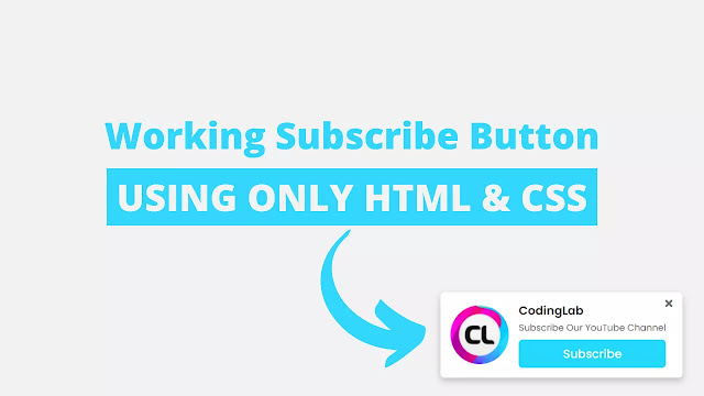
The image I have given on the image is the actual design of subscribe button that we are going to build today. As you can see on that image on the right side there is one logo and on the left side, some text and one subscribe button, and one small cross button. Basically, when we clicked on that subscribe button, we will directly be redirected to the youtube channel of the coding lab and this cross button is for hiding that toast notification.
I highly recommend you to watch a full video tutorial of this programming web push notification or subscribe button to see the real demo of this subscribe button and its animation. After watching the video tutorial of this CSS toast notification with subscribe button you will know how all the code are perfectly working in this programming.
Tutorial of Working Subscribe Button using HTML & CSS
As you have seen in the video tutorial of this programming subscribe button. First when I clicked on the cross or cancel button, that subscribe box move to the right side and hides, again I reload the webpage that subscribes button smoothly appears with awesome animation. When I hover on the subscribe button its color sidely changes into darker, and I clicked on the subscribe button we directly move to the youtube channel to subscribe.
Actually, we can make this redirection to youtube or other sites from HTML anchor tag. I have also used CSS code to make that beautiful animation and design. If you are familiar with HTML & CSS then you can easily build this web push notification or CSS toast notification with subscribe button. Those friends who are feeling difficulty to built this program, don’t worry I have provided a free source code file of this design below.
You May Like This:
Subscribe Button [Source Code]
First of all, you need to create HTML & CSS file to copy the given codes. After creating these two files then you can copy-paste all the code in your document easily. You can also download all source code files from the given download button.
<!DOCTYPE html>
<!-- Created By CodingLab - www.codinglabweb.com -->
<html lang="en" dir="ltr">
  <head>
    <meta charset="UTF-8">
    <meta name="viewport" content="width=device-width, initial-scale=1.0">
    <link rel="stylesheet" href="style.css">
    <!-- Fontawesome CDN Link -->
    <link rel="stylesheet" href="https://cdnjs.cloudflare.com/ajax/libs/font-awesome/5.15.2/css/all.min.css"/>
    <title> Working Subscribe Button | CodingLab </title>
   </head>
<body>
  <div class="container">
    <input type="radio" id="hide">
    <div class="box">
      <label for="hide"><i class="fas fa-times"></i></label>
      <div class="logo">
        <img src="logo.png" alt="">
      </div>
      <div class="right">
        <div class="text-1">CodingLab</div>
        <div class="text-2">Subscribe Our YouTube Channel</div>
        <a href="https://www.youtube.com/channel/UCBlr2jG1onljL-gUy9bbhJw?sub_confirmation=1" target="_blank">Subscribe</a>
      </div>
    </div>
  </div>

</body>
</html>
/* Google Font CDN Link */
@import url('https://fonts.googleapis.com/css2?family=Poppins:wght@200;300;400;500;600;700&display=swap');
*{
  margin: 0;
  padding: 0;
  box-sizing: border-box;
  font-family: 'Poppins', sans-serif;
}
body{
  height: 100vh;
  background: #f2f2f2;
  overflow: hidden;
}
.container{
  position: absolute;
  right: 30px;
  bottom: 30px;
}

.container .box{
  background: #fff;
  display: flex;
  align-items: center;
  border-radius: 6px;
  padding: 15px 25px 15px 15px;
  box-shadow: 0 5px 10px rgba(0, 0, 0, 0.2);
  position: relative;
  animation: show_box 0.8s ease forwards;
}
@keyframes show_box {
  0%{
    transform: translateX(100%);
  }
  40%{
    transform: translateX(-5%);
  }
  80%{
    transform: translateX(0%);
  }
  100%{
    transform: translateX(-10px);
  }
}
#hide:checked ~ .box{
  animation: hide_box 0.8s ease forwards;
}
@keyframes hide_box {
  0%{
    transform: translateX(0%);
  }
  40%{
    transform: translateX(5%);
  }
  80%{
    transform: translateX(0%);
  }
  100%{
    transform: translateX(calc(100% + 35px ));
  }
}
.container .box i{
  position: absolute;
  right: 15px;
  top: 10px;
  color: #666;
  cursor: pointer;
  transition: all 0.3s ease;
}
.container i:hover{
  color: #000;
}
.container .logo{
  height: 90px;
  width: 90px;
  margin-right: 15px;
}
.container .logo img{
  height: 100%;
  width: 100%;
  object-fit: cover;
}
.box .right{
  display: flex;
  flex-direction: column;
}
.box .right .text-1{
  font-size: 18px;
  font-weight: 600;
  color: #333;
}
.box .right .text-2{
  font-size: 14px;
  color: #666;
  margin: 2px 0 8px 0;
}
.box .right a{
  font-size: 18px;
  font-weight: 500;
  display: block;
  padding: 8px 0;
  background: #24d8fc;
  border-radius: 6px;
  color: #fff;
  text-align: center;
  text-decoration: none;
  transition: all 0.4s ease;
}
.box .right a:hover{
  background-color: #03bde2;
}
.container #hide{
  display: none;
}


Very nice
Yeah we need to add some javascript code for it.
Can we make it so when the user clicks the subscribe button, the notification does not show up again?