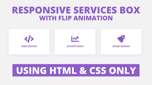
Hello readers, Today in this blog you’ll learn how to create a Fully Responsive Services Box with Flip Animation using only HTML & CSS. Earlier I’ve shared a blog on how to create an Awesome Product Card Design in HTML & CSS. You may have seen the services box on many websites.
The services page is one of the most important pages on your website to show what you offer to your visitors or content viewers. Based on the service you need to figure out the best way to explain it. These could be through short sentences, long paragraphs, bullet point sections, or videos.
In this program (Responsive Services Box with Flip Animation), on the webpage, there are three service cards or boxes with the icon and title of the services but when you hover on a particular box then the description of that hovered services card will be visible with a flip animation. This flip animation is fully based on HTML & CSS and these boxes are responsive for any device.
If you’re feeling difficult to understand what I am saying. You can watch a full video tutorial on this program (Responsive Services Box with Flip Animation).
Video Tutorial of Responsive Services Box with Flip Animation
In the video, you have seen the flip animation of these Responsive Service Cards or Boxes and I hope you have understood the codes behind creating these cards and their animation. As you know, this is a pure CSS program so there are no vast codes used on this Services Box program. I have used the CSS grid property to make these cards responsive.
If you like this program (Responsive Services Box with Flip Animation) and want to get source codes. You can easily get the source codes of this program. To get the source codes you just need to scroll down. You can use this program on your projects, websites, and HTML pages.
You might like this:
Responsive Services Box with Flip Animation [Source Codes]
To create this program (Responsive Services Box with Flip Animation). First, you need to create two Files one HTML File and another one is CSS File. After creating these files just paste the following codes in your file.
First, create an HTML file with the name of index.html and paste the given codes in your HTML file. Remember, you’ve to create a file with .html extension.
<!DOCTYPE html>
<!-- Created By CodingNepal -->
<html lang="en" dir="ltr">
   <head>
      <meta charset="utf-8">
      <title>Responsive Services Box | CodingNepal</title>
      <link rel="stylesheet" href="style.css">
      <link rel="stylesheet" href="https://cdnjs.cloudflare.com/ajax/libs/font-awesome/5.15.3/css/all.min.css"/>
      <meta name="viewport" content="width=device-width, initial-scale=1.0">
   </head>
   <body>
      <div class="wrapper">
         <div class="box">
            <div class="front-face">
               <div class="icon">
                  <i class="fas fa-code"></i>
               </div>
               <span>Web Design</span>
            </div>
            <div class="back-face">
               <span>Web Design</span>
               <p>
                  Lorem ipsum dolor sit amet, consectetur adipisicing elit. Rem in deleniti vitae beatae veritatis aliquid porro perspiciatis dolores impedit ad.
               </p>
            </div>
         </div>
         <div class="box">
            <div class="front-face">
               <div class="icon">
                  <i class="fas fa-chart-line"></i>
               </div>
               <span>Advertising</span>
            </div>
            <div class="back-face">
               <span>Advertising</span>
               <p>
                  Lorem ipsum dolor sit amet, consectetur adipisicing elit. Rem in deleniti vitae beatae veritatis aliquid porro perspiciatis dolores impedit ad.
               </p>
            </div>
         </div>
         <div class="box">
            <div class="front-face">
               <div class="icon">
                  <i class="fas fa-rocket"></i>
               </div>
               <span>Game Design</span>
            </div>
            <div class="back-face">
               <span>Game Design</span>
               <p>
                  Lorem ipsum dolor sit amet, consectetur adipisicing elit. Rem in deleniti vitae beatae veritatis aliquid porro perspiciatis dolores impedit ad.
               </p>
            </div>
         </div>
      </div>
   </body>
</html>
Second, create a CSS file with the name of style.css and paste the given codes in your CSS file. Remember, you’ve to create a file with .css extension.
@import url('https://fonts.googleapis.com/css?family=Poppins:400,500,600,700&display=swap');
*{
  margin: 0;
  padding: 0;
  box-sizing: border-box;
  font-family: 'Poppins', sans-serif;
}
body{
  height: 100%;
  width: 100%;
  text-align: center;
  background: #f2f2f2;
}
.wrapper{
  display: grid;
  margin: 200px 90px auto;
  grid-gap: 20px;
  grid-template-columns: repeat(auto-fit, minmax(350px, 1fr));
}
@media (max-width: 700px) {
  .wrapper{
    margin: 200px auto;
  }
}
.wrapper .box{
  width: 350px;
  margin: 0 auto;
  position: relative;
  perspective: 1000px;
}
.wrapper .box .front-face{
  background: #fff;
  height: 220px;
  width: 100%;
  display: flex;
  flex-direction: column;
  justify-content: center;
  box-shadow: 0px 5px 20px 0px rgba(0, 81, 250, 0.1);
  transition: all 0.5s ease;
}
.box .front-face .icon{
  height: 80px;
}
.box .front-face .icon i{
  font-size: 65px;
}
.box .front-face span,
.box .back-face span{
  font-size: 22px;
  font-weight: 600;
  text-transform: uppercase;
}
.box .front-face .icon i,
.box .front-face span{
  background: linear-gradient(-135deg, #c850c0, #4158d0);
  -webkit-background-clip: text;
  -webkit-text-fill-color: transparent;
}
.box .back-face{
  position: absolute;
  top: 0;
  left: 0;
  z-index: 1;
  height: 220px;
  width: 100%;
  padding: 30px;
  color: #fff;
  opacity: 0;
  transform-style: preserve-3d;
  backface-visibility: hidden;
  background: linear-gradient(-135deg, #c850c0, #4158d0);
  transform: translateY(110px) rotateX(-90deg);
  box-shadow: 0px 5px 20px 0px rgba(0, 81, 250, 0.1);
  transition: all 0.5s ease;
}
.box .back-face p{
  margin-top: 10px;
  text-align: justify;
}
.box:hover .back-face{
  opacity: 1;
  transform: rotateX(0deg);
}
.box:hover .front-face{
  opacity: 0;
  transform: translateY(-110px) rotateX(90deg);
}
That’s all, now you’ve successfully created a Responsive Services Box with Flip Animation using only HTML & CSS. If your code doesn’t work or you’ve faced any error/problem then please comment down or contact us from the contact page.


Where can I find your Greeting Card Script?
Thanks
where do i add the link to the individual service boxes question mark
You can use anchor tag
please sir tell us that how to add on blogger please sir
Mene realtime chat app me ek video banaya hai wo dekho
sir php se file uploading system kese bnae jime agar koi file upload karega to vo web me save ho jayega aur use dusre log bhi dekh skte h
There is not tip bro..it's all about learning
you are really full stack web developer, can you share some tips.
Tnx
Thank you… Keep learning bro.
you are genius bro. Please guide us bro in creating such.