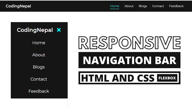
Hello readers, Today in this blog you’ll learn how to create a Fully Responsive Navigation Menu Bar in HTML & CSS using Flexbox. Earlier I have shared also a Responsive Navbar using HTML & CSS without using Flexbox, now it’s time to create a Responsive Navbar using CSS Flexbox.
A website navigation bar is most commonly displayed as a plane/horizontal list of links at the top of each page. It may be below the header or logo, but it is always located before the main content of the page.
As you can see in the image, this is a fully responsive navbar using HTML & CSS (Flexbox). When you resize or minimize your PC window, this navbar automatically takes their height and width according to the window width and height.
In the PC version, this navbar menu is shown in horizontal shape but in the mobile version, this navbar menu is shown in vertical shape. If you’re feeling difficult to understand what I am saying. You can watch a full video tutorial on this program (Responsive Navigation Menu Bar).
Video Tutorial of Responsive Navbar using CSS Flexbox
If you are a beginner, you can also create this program (Responsive Navigation Menu Bar). You can use this navbar in your projects, websites, and wherever you want. If you have basic knowledge of HTML & CSS, you can take this navbar at the next level with your creativity.
If you want to get the source code of this responsive navbar with flexbox. You can easily get the source codes of this program. To get the source codes you just need to scroll down.
You might like this:
Responsive Menu Bar using HTML & CSS [Source Codes]
To create this program (Responsive Navigation Menu Bar). First, you need to create two Files one HTML File and another one is CSS File. After creating these files just paste the following codes in your file.
First, create an HTML file with the name of index.html and paste the given codes in your HTML file. Remember, you’ve to create a file with .html extension.
<!DOCTYPE html>
<!-- Created By CodingNepal -->
<head>
   <meta charset="utf-8">
   <title>Responsive Navigation Bar</title>
   <link rel="stylesheet" href="style.css">
   <script src="https://code.jquery.com/jquery-3.4.1.js"></script>
   <link rel="stylesheet" href="https://cdnjs.cloudflare.com/ajax/libs/font-awesome/5.15.3/css/all.min.css"/>
   <meta name="viewport" content="width=device-width, initial-scale=1.0">
</head>
<body>
   <nav>
      <ul>
         <li class="logo">CodingNepal</li>
         <li class="items"><a href="#">Home</a></li>
         <li class="items"><a href="#">About</a></li>
         <li class="items"><a href="#">Blogs</a></li>
         <li class="items"><a href="#">Contact</a></li>
         <li class="items"><a href="#">Feedback</a></li>
         <li class="btn"><a href="#"><i class="fas fa-bars"></i></a></li>
      </ul>
   </nav>
   <script>
      $(document).ready(function(){
        $('.btn').click(function(){
          $('.items').toggleClass("show");
          $('ul li').toggleClass("hide");
        });
      });
   </script>
</body>
</html>
Second, create a CSS file with the name of style.css and paste the given codes in your CSS file. Remember, you’ve to create a file with .css extension.
@import url('https://fonts.googleapis.com/css?family=Montserrat:400,500,600,700&display=swap');
*{
  margin: 0;
  padding: 0;
  box-sizing: border-box;
  font-family: 'Montserrat',sans-serif;
}
nav{
  background: #151515;
  padding: 5px 40px;
}
nav ul{
  list-style: none;
  display: flex;
  flex-wrap: wrap;
  align-items: center;
  justify-content: center;
}
nav ul li{
  padding: 15px 0;
  cursor: pointer;
}
nav ul li.items{
  position: relative;
  width: auto;
  margin: 0 16px;
  text-align: center;
  order: 3;
}
nav ul li.items:after{
  position: absolute;
  content: '';
  left: 0;
  bottom: 5px;
  height: 2px;
  width: 100%;
  background: #33ffff;
  opacity: 0;
  transition: all 0.2s linear;
}
nav ul li.items:hover:after{
  opacity: 1;
  bottom: 8px;
}
nav ul li.logo{
  flex: 1;
  color: white;
  font-size: 23px;
  font-weight: 600;
  cursor: default;
  user-select: none;
}
nav ul li a{
  color: white;
  font-size: 18px;
  text-decoration: none;
  transition: .4s;
}
nav ul li:hover a{
  color: cyan;
}
nav ul li i{
  font-size: 23px;
}
nav ul li.btn{
  display: none;
}
nav ul li.btn.hide i:before{
  content: '\f00d';
}
@media all and (max-width: 900px){
  nav{
    padding: 5px 30px;
  }
  nav ul li.items{
    width: 100%;
    display: none;
  }
  nav ul li.items.show{
    display: block;
  }
  nav ul li.btn{
    display: block;
  }
  nav ul li.items:hover{
    border-radius: 5px;
    box-shadow: inset 0 0 5px #33ffff,
                inset 0 0 10px #66ffff;
  }
  nav ul li.items:hover:after{
    opacity: 0;
  }
}
That’s all, now you’ve successfully created a Responsive Navigation Menu Bar using CSS Flexbox. If your code does not work or you’ve faced any error/problem then please comment down or contact us from the contact page.


Thanks bro!
Thanks for your content..I have facing some issues kindly help me.I use JavaScript instead of JQuery . when I clicked on button it’s only show first list (Home) only …I used same HTML and CSS.JavaScript code is this:
let btn = document.querySelector(“.btn”);
let links = document.querySelector(“.items”);
btn.addEventListener(“click”,function(){
links.classList.toggle(“show”);
links.classList.toggle(“hide”);
})
Please contact us here – [email protected]
hey bro sometimes the icons are not displayed for me
You're welcome…Keep visiting!
Thanks for your effort bringing such nice content!!! keep it up