Q: How To create a footer in HTML CSS?
I have provided essential tips tricks, articles, and tutorials to create a fully responsive footer as images.
Hello Readers, welcome to my other blog, today in this blog I’m going to create a Responsive Footer in HTML CSS. Earlier I have shared How to create a Responsive Navigation Menu and now it’s time to create a footer section.
What is Footer?
In simple language, the footer is a section or full box which exists at the bottom of any type of webpages with important hyperlinks, information, and message or subscribe box. Footer is the most important section for all the websites. Footer can be depended upon the types of the webpage.
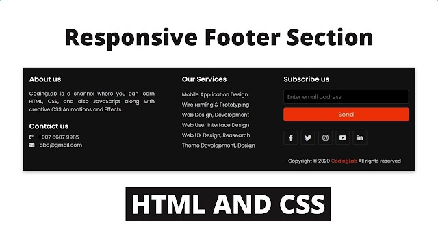
As you can see on the given image of the footer design that I have given on the webpage. Many people are confused about what they need to put inside the footer. We can put essential quick links, logo our privacy policy link, and copyright message. We can also add our social media icon inside the footer. By adding these types of elements we can make a good footer.
For the footer or any type of design we should add code inside the body tag, we have a separate tag for the footer as the name of the footer. We have to add HTML code for the footer inside the footer tag. To get the footer stick to the bottom we have to give the following CSS.
- position: fixed;
- width: 100%;
- left: 0px;
- bottom: 0px;
From the CSS media query, we can make the footer fully responsive, you can watch on the video tutorial how we can make the footer responsive in just seconds.
Responsive Footer HTML CSS | Full Video Tutorial of Footer
As you have seen on the given tutorial of this program [Responsive Footer HTML CSS]. There is a full-width section on the bottom with black color. There are many topics with hyperlinks like phone numbers, emails.
Have you notice that when you hover those hyperlinks it’s a color change that looks really awesome. There is also a section on the right side for subscribing. As you have seen that when I have decreased the width of this program, the footer doesn’t skew its fit automatically as screen size.
If you are familiar with HTML & CSS then you can easily create this Footer section. Those friends who are feeling difficult to understand this, don’t worry I have provided the full source code of this program Responsive Footer. Feel free to use the following codes.
You Might Like This:
Responsive Footer Section | Free Source Code
To paste the given codes of this program, first of all, you need to create two files one is an HTML file and another is a CSS file, after creating these two files you can easily copy-paste the given codes in your HTML & CSS files. You can also download all source code files directly from the given Download Button.
<!DOCTYPE html>
<!-- Created By CodingLab - www.codinglabweb.com -->
<html lang="en" dir="ltr">
  <head>
    <meta charset="UTF-8">
    <title> Responsive Footer | CodingLab</title>
    <link rel="stylesheet" href="style.css">
     <meta name="viewport" content="width=device-width, initial-scale=1.0">
    <link rel="stylesheet" href="https://cdnjs.cloudflare.com/ajax/libs/font-awesome/5.15.2/css/all.min.css"/>
   </head>
<body>
 <footer>
   <div class="content">
     <div class="left box">
       <div class="upper">
         <div class="topic">About us</div>
         <p>CodingLab is a channel where you can learn HTML,
         CSS, and also JavaScript along with creative CSS Animations and Effects.</p>
       </div>
       <div class="lower">
         <div class="topic">Contact us</div>
         <div class="phone">
           <a href="#"><i class="fas fa-phone-volume"></i>+007 9089 6767</a>
         </div>
         <div class="email">
           <a href="#"><i class="fas fa-envelope"></i>[email protected]</a>
         </div>
       </div>
     </div>
     <div class="middle box">
       <div class="topic">Our Services</div>
       <div><a href="#">Web Design, Development</a></div>
       <div><a href="#">Web UX Design, Reasearch</a></div>
       <div><a href="#">Web User Interface Design</a></div>
       <div><a href="#">Theme Development, Design</a></div>
       <div><a href="#">Mobile Application Design</a></div>
       <div><a href="#">Wire raming & Prototyping</a></div>
     </div>
     <div class="right box">
       <div class="topic">Subscribe us</div>
       <form action="#">
         <input type="text" placeholder="Enter email address">
         <input type="submit" name="" value="Send">
         <div class="media-icons">
           <a href="#"><i class="fab fa-facebook-f"></i></a>
           <a href="#"><i class="fab fa-instagram"></i></a>
           <a href="#"><i class="fab fa-twitter"></i></a>
           <a href="#"><i class="fab fa-youtube"></i></a>
           <a href="#"><i class="fab fa-linkedin-in"></i></a>
         </div>
       </form>
     </div>
   </div>
   <div class="bottom">
     <p>Copyright © 2020 <a href="#">CodingLab</a> All rights reserved</p>
   </div>
 </footer>

</body>
</html>
@import url('https://fonts.googleapis.com/css2?family=Poppins:wght@200;300;400;500;600;700&display=swap');
*{
  margin: 0;
  padding: 0;
  box-sizing: border-box;
  font-family: 'Poppins',sans-serif;
  text-decoration: none;
}
footer{
  width: 100%;
  position: fixed;
  bottom: 0;
  left: 0;
  background: #111;
}
footer .content{
  max-width: 1350px;
  margin: auto;
  padding: 20px;
  display: flex;
  flex-wrap: wrap;
  justify-content: space-between;
}
footer .content p,a{
  color: #fff;
}
footer .content .box{
  width: 33%;
  transition: all 0.4s ease;
}
footer .content .topic{
  font-size: 22px;
  font-weight: 600;
  color: #fff;
  margin-bottom: 16px;

}
footer .content p{
  text-align: justify;
}
footer .content .lower .topic{
  margin: 24px 0 5px 0;
}
footer .content .lower i{
  padding-right: 16px;
}
footer .content .middle{
  padding-left: 80px;
}
footer .content .middle a{
  line-height: 32px;
}
footer .content .right input[type="text"]{
  height: 45px;
  width: 100%;
  outline: none;
  color: #d9d9d9;
  background: #000;
  border-radius: 5px;
  padding-left: 10px;
  font-size: 17px;
  border: 2px solid #222222;
}
footer .content .right input[type="submit"]{
  height: 42px;
  width: 100%;
  font-size: 18px;
  color: #d9d9d9;
  background: #eb2f06;
  outline: none;
  border-radius: 5px;
  letter-spacing: 1px;
  cursor: pointer;
  margin-top: 12px;
  border: 2px solid #eb2f06;
  transition: all 0.3s ease-in-out;
}
.content .right input[type="submit"]:hover{
  background: none;
  color:  #eb2f06;
}
footer .content .media-icons a{
  font-size: 16px;
  height: 45px;
  width: 45px;
  display: inline-block;
  text-align: center;
  line-height: 43px;
  border-radius: 5px;
  border: 2px solid #222222;
  margin: 30px 5px 0 0;
  transition: all 0.3s ease;
}
.content .media-icons a:hover{
  border-color: #eb2f06;
}
footer .bottom{
  width: 100%;
  text-align: right;
  color: #d9d9d9;
  padding: 0 40px 5px 0;
}
footer .bottom a{
  color: #eb2f06;
}
footer a{
  transition: all 0.3s ease;
}
footer a:hover{
  color: #eb2f06;
}
@media (max-width:1100px) {
  footer .content .middle{
    padding-left: 50px;
  }
}
@media (max-width:950px){
  footer .content .box{
    width: 50%;
  }
  .content .right{
    margin-top: 40px;
  }
}
@media (max-width:560px){
  footer{
    position: relative;
  }
  footer .content .box{
    width: 100%;
    margin-top: 30px;
  }
  footer .content .middle{
    padding-left: 0;
  }
}


hey there its failed even to odownload the source code
nice
I liked your website. your content very interesting and i haved seen all of them. you may also like our website Moditech77. you can check it.
Great Article on Blog design Css And Html Tutorials and Premium Blogger Themes Free Download
Blog Name Techy Jeeshan
Blog Url :- https://www.techyjeeshan.xyz/