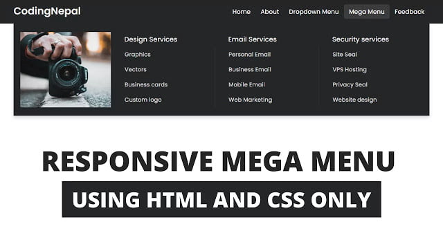
Hello readers, Today in this blog you’ll learn how to create a Responsive Mega Menu and Dropdown Menu using only HTML & CSS. Earlier I have shared a blog on how to create a Responsive Dropdown Menu but now I’m going to create Mega Menu which is based on HTML & CSS only.
A mega menu is a drop-down menu with multi-level nav links that allows you to carry your website’s navigation into a single menu. A mega menu lets the user or content viewers get information about website content through the main menu.
In this program [Responsive Mega Menu and Dropdown Menu], there is navigation or navbar on the top of the webpage and it contains a logo on the left side and five nav items/links on the right side. One nav link has a dropdown menu and another one has a mega menu and it only shows when you hover on the parent nav link. If you’re feeling difficult to understand what I am saying. You can watch a full video tutorial on this program [Responsive Mega Menu].
Video Tutorial of Responsive Mega Menu
In the video, you have seen the responsive mega and dropdown menu and in this video, I have only created the static mega and dropdown menu means I didn’t code of responsive part but in part 2 of this video I’ve made this mega menu fully responsive for any devices, Click here to watch part 2 video of this tutorial.
As you know, this is a pure CSS program that means only HTML & CSS are used to create this mega menu. If you’re a beginner and difficult to understand how I toggled the menu bar to show or hide then understand the concept of <input type=”checkbox”> and <label> tag. In the label tag, there is a for attribute and we have to pass the id name of the checkbox inside for attribute to control the checkbox from the label. And to make this mega menu responsive I used the CSS @media property.
You might like this:
Responsive Mega Menu and Dropdown Menu [Source Codes]
To create this program (Responsive Mega Menu and Dropdown Menu). First, you need to create two Files one HTML File and another one is CSS File. After creating these files just paste the following codes into your file. First, create an HTML file with the name of index.html and paste the given codes in your HTML file. Remember, you’ve to create a file with .html extension.
<!DOCTYPE html>
<!-- Created By CodingNepal - www.codingnepalweb.com -->
<html lang="en">
<head>
    <meta charset="UTF-8">
    <meta name="viewport" content="width=device-width, initial-scale=1.0">
    <title>Responsive Mega Menu | CodingNepal</title>
    <link rel="stylesheet" href="style.css">
    <link rel="stylesheet" href="https://cdnjs.cloudflare.com/ajax/libs/font-awesome/5.15.3/css/all.min.css"/>
</head>
<body>
  <nav>
    <div class="wrapper">
      <div class="logo"><a href="#">CodingNepal</a></div>
      <input type="radio" name="slider" id="menu-btn">
      <input type="radio" name="slider" id="close-btn">
      <ul class="nav-links">
        <label for="close-btn" class="btn close-btn"><i class="fas fa-times"></i></label>
        <li><a href="#">Home</a></li>
        <li><a href="#">About</a></li>
        <li>
          <a href="#" class="desktop-item">Dropdown Menu</a>
          <input type="checkbox" id="showDrop">
          <label for="showDrop" class="mobile-item">Dropdown Menu</label>
          <ul class="drop-menu">
            <li><a href="#">Drop menu 1</a></li>
            <li><a href="#">Drop menu 2</a></li>
            <li><a href="#">Drop menu 3</a></li>
            <li><a href="#">Drop menu 4</a></li>
          </ul>
        </li>
        <li>
          <a href="#" class="desktop-item">Mega Menu</a>
          <input type="checkbox" id="showMega">
          <label for="showMega" class="mobile-item">Mega Menu</label>
          <div class="mega-box">
            <div class="content">
              <div class="row">
                <img src="img.jpg" alt="">
              </div>
              <div class="row">
                <header>Design Services</header>
                <ul class="mega-links">
                  <li><a href="#">Graphics</a></li>
                  <li><a href="#">Vectors</a></li>
                  <li><a href="#">Business cards</a></li>
                  <li><a href="#">Custom logo</a></li>
                </ul>
              </div>
              <div class="row">
                <header>Email Services</header>
                <ul class="mega-links">
                  <li><a href="#">Personal Email</a></li>
                  <li><a href="#">Business Email</a></li>
                  <li><a href="#">Mobile Email</a></li>
                  <li><a href="#">Web Marketing</a></li>
                </ul>
              </div>
              <div class="row">
                <header>Security services</header>
                <ul class="mega-links">
                  <li><a href="#">Site Seal</a></li>
                  <li><a href="#">VPS Hosting</a></li>
                  <li><a href="#">Privacy Seal</a></li>
                  <li><a href="#">Website design</a></li>
                </ul>
              </div>
            </div>
          </div>
        </li>
        <li><a href="#">Feedback</a></li>
      </ul>
      <label for="menu-btn" class="btn menu-btn"><i class="fas fa-bars"></i></label>
    </div>
  </nav>

  <div class="body-text">
    <div class="title">Responsive Dropdown and Mega Menu</div>
    <div class="sub-title">using only HTML & CSS</div>
  </div>

</body>
</html>
Second, create a CSS file with the name of style.css and paste the given codes in your CSS file. Remember, you’ve to create a file with .css extension.
@import url('https://fonts.googleapis.com/css2?family=Poppins:wght@200;300;400;500;600;700&display=swap');
*{
  margin: 0;
  padding: 0;
  box-sizing: border-box;
  font-family: 'Poppins', sans-serif;
}
nav{
  position: fixed;
  z-index: 99;
  width: 100%;
  background: #242526;
}
nav .wrapper{
  position: relative;
  max-width: 1300px;
  padding: 0px 30px;
  height: 70px;
  line-height: 70px;
  margin: auto;
  display: flex;
  align-items: center;
  justify-content: space-between;
}
.wrapper .logo a{
  color: #f2f2f2;
  font-size: 30px;
  font-weight: 600;
  text-decoration: none;
}
.wrapper .nav-links{
  display: inline-flex;
}
.nav-links li{
  list-style: none;
}
.nav-links li a{
  color: #f2f2f2;
  text-decoration: none;
  font-size: 18px;
  font-weight: 500;
  padding: 9px 15px;
  border-radius: 5px;
  transition: all 0.3s ease;
}
.nav-links li a:hover{
  background: #3A3B3C;
}
.nav-links .mobile-item{
  display: none;
}
.nav-links .drop-menu{
  position: absolute;
  background: #242526;
  width: 180px;
  line-height: 45px;
  top: 85px;
  opacity: 0;
  visibility: hidden;
  box-shadow: 0 6px 10px rgba(0,0,0,0.15);
}
.nav-links li:hover .drop-menu,
.nav-links li:hover .mega-box{
  transition: all 0.3s ease;
  top: 70px;
  opacity: 1;
  visibility: visible;
}
.drop-menu li a{
  width: 100%;
  display: block;
  padding: 0 0 0 15px;
  font-weight: 400;
  border-radius: 0px;
}
.mega-box{
  position: absolute;
  left: 0;
  width: 100%;
  padding: 0 30px;
  top: 85px;
  opacity: 0;
  visibility: hidden;
}
.mega-box .content{
  background: #242526;
  padding: 25px 20px;
  display: flex;
  width: 100%;
  justify-content: space-between;
  box-shadow: 0 6px 10px rgba(0,0,0,0.15);
}
.mega-box .content .row{
  width: calc(25% - 30px);
  line-height: 45px;
}
.content .row img{
  width: 100%;
  height: 100%;
  object-fit: cover;
}
.content .row header{
  color: #f2f2f2;
  font-size: 20px;
  font-weight: 500;
}
.content .row .mega-links{
  margin-left: -40px;
  border-left: 1px solid rgba(255,255,255,0.09);
}
.row .mega-links li{
  padding: 0 20px;
}
.row .mega-links li a{
  padding: 0px;
  padding: 0 20px;
  color: #d9d9d9;
  font-size: 17px;
  display: block;
}
.row .mega-links li a:hover{
  color: #f2f2f2;
}
.wrapper .btn{
  color: #fff;
  font-size: 20px;
  cursor: pointer;
  display: none;
}
.wrapper .btn.close-btn{
  position: absolute;
  right: 30px;
  top: 10px;
}

@media screen and (max-width: 970px) {
  .wrapper .btn{
    display: block;
  }
  .wrapper .nav-links{
    position: fixed;
    height: 100vh;
    width: 100%;
    max-width: 350px;
    top: 0;
    left: -100%;
    background: #242526;
    display: block;
    padding: 50px 10px;
    line-height: 50px;
    overflow-y: auto;
    box-shadow: 0px 15px 15px rgba(0,0,0,0.18);
    transition: all 0.3s ease;
  }
  /* custom scroll bar */
  ::-webkit-scrollbar {
    width: 10px;
  }
  ::-webkit-scrollbar-track {
    background: #242526;
  }
  ::-webkit-scrollbar-thumb {
    background: #3A3B3C;
  }
  #menu-btn:checked ~ .nav-links{
    left: 0%;
  }
  #menu-btn:checked ~ .btn.menu-btn{
    display: none;
  }
  #close-btn:checked ~ .btn.menu-btn{
    display: block;
  }
  .nav-links li{
    margin: 15px 10px;
  }
  .nav-links li a{
    padding: 0 20px;
    display: block;
    font-size: 20px;
  }
  .nav-links .drop-menu{
    position: static;
    opacity: 1;
    top: 65px;
    visibility: visible;
    padding-left: 20px;
    width: 100%;
    max-height: 0px;
    overflow: hidden;
    box-shadow: none;
    transition: all 0.3s ease;
  }
  #showDrop:checked ~ .drop-menu,
  #showMega:checked ~ .mega-box{
    max-height: 100%;
  }
  .nav-links .desktop-item{
    display: none;
  }
  .nav-links .mobile-item{
    display: block;
    color: #f2f2f2;
    font-size: 20px;
    font-weight: 500;
    padding-left: 20px;
    cursor: pointer;
    border-radius: 5px;
    transition: all 0.3s ease;
  }
  .nav-links .mobile-item:hover{
    background: #3A3B3C;
  }
  .drop-menu li{
    margin: 0;
  }
  .drop-menu li a{
    border-radius: 5px;
    font-size: 18px;
  }
  .mega-box{
    position: static;
    top: 65px;
    opacity: 1;
    visibility: visible;
    padding: 0 20px;
    max-height: 0px;
    overflow: hidden;
    transition: all 0.3s ease;
  }
  .mega-box .content{
    box-shadow: none;
    flex-direction: column;
    padding: 20px 20px 0 20px;
  }
  .mega-box .content .row{
    width: 100%;
    margin-bottom: 15px;
    border-top: 1px solid rgba(255,255,255,0.08);
  }
  .mega-box .content .row:nth-child(1),
  .mega-box .content .row:nth-child(2){
    border-top: 0px;
  }
  .content .row .mega-links{
    border-left: 0px;
    padding-left: 15px;
  }
  .row .mega-links li{
    margin: 0;
  }
  .content .row header{
    font-size: 19px;
  }
}
nav input{
  display: none;
}

.body-text{
  position: absolute;
  top: 50%;
  left: 50%;
  transform: translate(-50%, -50%);
  width: 100%;
  text-align: center;
  padding: 0 30px;
}
.body-text div{
  font-size: 45px;
  font-weight: 600;
}
That’s all, now you’ve successfully created a Responsive Mega Menu and Dropdown Menu using only HTML & CSS. If your code does not work or you’ve faced any error/problem then please download the source code files from the given download button. It’s free and a .zip file will be downloaded then you’ve to extract it.


The fontawesome link is not loading properly. Just replace fas fa-times with the word “Close” and the other icon reference with “Menu”
the Pinned link is “invalid file type”. The menu icon does not show up when screen size is reduced. How can I solve this issue? It’s a big problem for me, no matter what it disappears when the screen is adjust to small size.
Also it would be really help me — to provide me code to:
1) I insert a Logo image (100px max with a link to “home”)- instead of just type for logo.
2) where do I place main content of each page (such as video or image slider) underneath menu. I am confused because your code is all in the “” instead of in a . I don’t understand. Please help me! Thank you. Your work is elegant.
OOps
2) where do I place main content – such as video or an image slider – underneath the menu. I don’t understand why the menu code is in the “body” instead of a “header”.
It looks amazing! But, is there a way to add space between the links and the logo? I would like for the logo to be placed far to the left, and the links far to the right, instead of both of them centered and close to each other…Can you help me out?
Thank you so much
Thanks dear! But I want the codes of second part too!
These are the codes of part 1 and part 2
I don’t understand the meaning of https://kit.fontawesome.com/a076d05399.js . Can you please tell me what is it?
It’s the font awesome script used to show icons like the hamburger menu in our project.
Everything is nice but i have some problem encountered in mega menu. I can’t access mega menu when i try to click sub-menu in mega menu.Please help me.
Really nice work, I appreciate. Is it possible to activate the mega menu when clicked, not when hovered?
thank you so much.
for your helpful content.
You’re welcome and keep visiting.
How can you add the mega menu portion to an existing menu?
Cause there are second part of this, you’re invite to watch the following video https://www.youtube.com/watch?v=rB28hKxvN38&t=0s&ab_channel=CodingNepalCodingNepal. This is a continuation of part one.
Please read the pinned comment of this video
Please read the pinned comment of this video
This is exactly what I want, but it is not working for me. The hamburger menu icon does not appear at all. I have Windows 10; I have tried FireFox, Chrome, Opera, and Edge. I made no changes to your code. Any ideas what could be wrong?
It's exactly what I want, but the code does not work for me. No hamburger menu icon appears when the window is resized. I'm using Windows 10 with Wampserver running. I tried all the major browsers with the same result. I did not change your code at all. Any ideas what could be wrong?
Ok..Stay tuned with us
please check your codes with the given codes
Hello! I have one question, when I click on one of the navbar option, the navbar don´t dissapear, I don´t know if I could do this whith JavaScript or CSS removing or adding one class. Thanks for all.
Thanku sir
can you make a tutorial of responsive mega menu with logo and search bar?
Yes you can use it without any copyright issues
Yes you can use it without any copyright issues
Can I use this code, or any copyright required
Can I use this code for my site ? Or I have to purchase copyright
Is there an estimation how long I should stay tuned before this is going to happen?
You're welcome 🙂
You're welcome 🙂
Can you send screenshot of the problems on my Instagram account?
Sure.. Stay tuned with us.
Thank you!!
Thank you so much
Plz try to create a slider like in the youtube that you can see at home page
did anybody has a problem when using this?, when i try it is not rendering properly.
Excelent work !!
Sure I'll try in my upcoming videos 🙂
Pls do not put the music in background , rather guide with commentary while doing the things. It will help the learner to grasp fast.