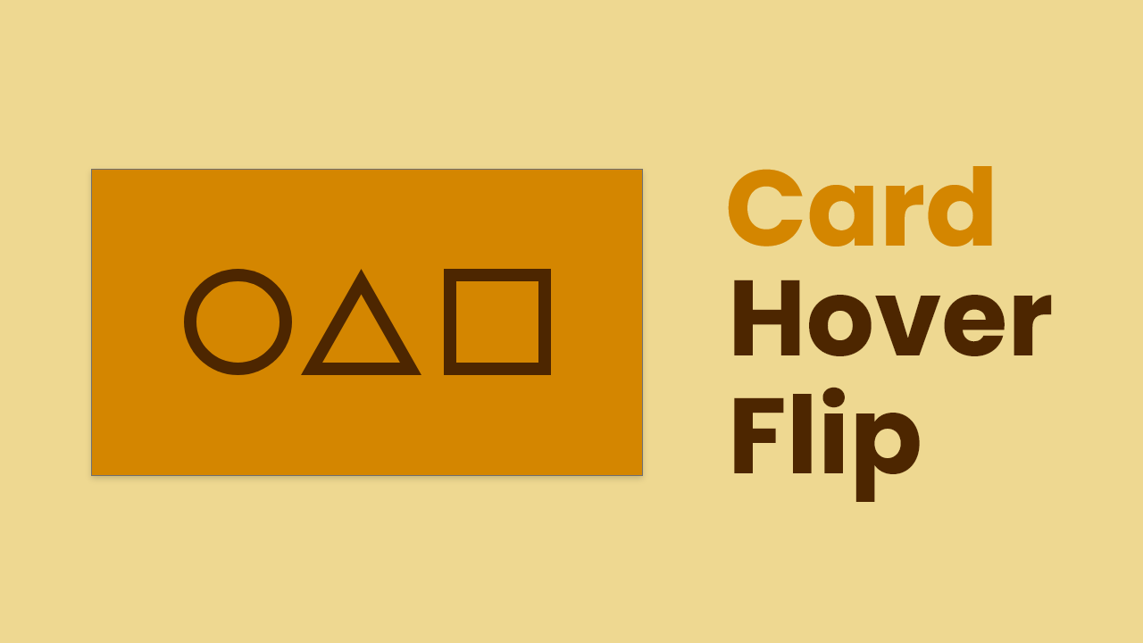
Hello friend, hope you are doing well, as you know I have been creating lots of JavaScript projects for several. That’s why today I’m thinking of a card with flipping animation by using HTML and CSS only. Actually, when you hover on it, the card will flip and we would see the backface of the card.
Let’s have a look at the given image of the card. The design of the card is, I have inspired by the famous web series squid game. The icons you are seeing on the image are made by HTML and CSS only, I have not used any font icons.
Basically, when you hover on the card flip with 3d animation and you can see the backside of this card. On the backside, I have added an icon and number. Rather than words, I highly recommend you to watch the full video tutorial of this 3D flipping card. Then you will know the real demo of this card and its animation.
Card with flipping Animation in HTML CSS | Video
I have provided all the HTML and CSS source code of this Card with 3D Flipping Animation, before jumping into the source code files, you need to know some basic points of this project.
As you have seen on the given video tutorial of Card with flipping Animation. At first, you saw a card with three icons, and when I hovered on the card it flips and we saw the backside of that card. As you know, how to make a triangle with a border, circle, square, and home icon by using only HTML and CSS.
I could bring that icon from websites like font awesome and others, but I thought to make it with HTML and CSS, which makes our program more interesting and adventurous.
You Might Like This:
Card with flipping Animation [Source Code]
<!DOCTYPE html>
<!-- Coding By CodingNepal - codingnepalweb.com -->
<html lang="en" dir="ltr">
  <head>
    <meta charset="UTF-8">
    <title> Card with Flip Animation | CodingLab </title>
    <link rel="stylesheet" href="style.css">
   </head>
<body>
  <div class="wrapper">
    <div class="flip-card">
      <div class="front card">
        <span class="circle"></span>
        <span class="triangle"></span>
        <span class="square"></span>
      </div>
      <div class="back card">
        <span class="home-logo">
          <span class="icon"></span>
        </span>
        <span class="num">8650 4006</span>
      </div>
    </div>
  </div>
</body>
</html>
@import url('https://fonts.googleapis.com/css?family=Poppins:400,500,600,700&display=swap');
*{
  margin: 0;
  padding: 0;
  box-sizing: border-box;
  font-family: 'Poppins', sans-serif;
}
body{
  height: 100vh;
  display: flex;
  align-items: center;
  justify-content: center;
  background: #EED891;
}
.wrapper{
  position: relative;
  height: 330px;
  width: 620px;
  perspective: 1000px;
}
.wrapper .flip-card{
  position: relative;
  height: 100%;
  width: 100%;
  background: #D48600;
  transform-style: preserve-3d;
  transition: all 1s ease-in-out;
}
.wrapper:hover .flip-card{
  transform: rotateY(180deg);
}
.flip-card .card{
  display: flex;
  align-items: center;
  justify-content: center;
  height: 100%;
  width: 100%;
  background: #D48600;
  border-top: 2px solid #cc6600;
  border-left: 2px solid #cc6600;
  box-shadow: 0 5px 10px rgba(0,0,0,0.2);
  backface-visibility: hidden;
  position: absolute;
}
.card span.circle,
.card span.square{
  height: 110px;
  width: 110px;
  border: 10px solid #4d2600;
}
.card span.circle{
  border-radius: 50%;
}
.card span.triangle{
  position: relative;
  height: 0;
  width: 0;
  border-right: 60px solid transparent;
  border-left: 60px solid transparent;
  border-bottom: 110px solid #4d2600;
  margin-right: 16px;
}
.card span.triangle::before{
  content: "";
  position: absolute;
  height: 0;
  width: 0;
  left: -40px;
  top: 20px;
  border-right: 40px solid transparent;
  border-left: 40px solid transparent;
  border-bottom: 80px solid #D48600;
}
.back.card{
  transform: rotateY(180deg);
}
.back.card .home-logo{
  position: relative;
  height: 65px;
  width: 65px;
  border: 5px solid #4d2600;
  border-radius: 50%;
  margin-right: 16px;
}
.home-logo .icon{
  position: relative;
  top: 50%;
  left: 50%;
  transform: translate(-50%, -50%) translateY(6px);
  display: inline-block;
  height: 15px;
  width: 25px;
  background: #4d2600;
}
.home-logo .icon::before{
  content: "";
  position: absolute;
  top: -15px;
  height: 25px;
  width: 25px;
  background: #4d2600;
  transform: rotate(45deg);
}
.back.card .num{
  font-size: 25px;
  font-weight: 600;
  color: #4d2600;
}


Great! Just the thing I was looking for. ❤️