Hello my friends, In this blog, I’m going to create a Share Button Animation by using HTML CSS only. In my earlier blog, I have created a responsive footer section, now I will go for an animated share button with social media icons.
Basically, we can say a share button is the option to send music, videos, files, and others to the person. It helps users to directly send various things from one device to another by social media like Facebook Twitter. The share option is the most essential at this present time.
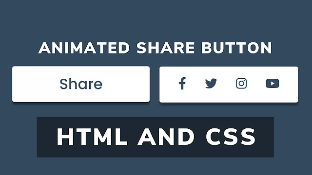
As you can see on the image on the webpage. There are two boxes, in the right side box it is named “Share” and in the right boxes, there are some social media icons that we use daily basis. Actually, in this program, there is only a box which is named share. To make you understand easier I have shown two boxes. When we hover on this share box the second box comes and that share button moves to the left side.
If you are feeling confused about this program[Share Button Animation]. I have provided a full video tutorial for this program. I’m sure, after watching this video all your confusion will clear.
Full Video Tutorial of Share Button Animation Using HTML CSS
As you have seen on the tutorial of this program[Share Button], At first there is only one button or box named “Share”, when we hover in this box that share button move to the right side and another box came from the left side. There is some social media icon in these boxes. When we move the cursor far from this box, first “share box” in the initial position and “Social media’s box” Move right. Have you noticed, when we hover on the social media icon it increases a little which looks quite awesome?
If you have basic knowledge about HTML and CSS you can easily build this program[Animate Share Button]. Those friends who are feeling difficulty making this program, don’t worry, I have provided all source code files below. This is a free program, you can use this program as your purpose.
Share Button Animation [Source Codes]
To copy the following codes you need to make two files, one is an HTML file and another is a CSS file. After creation these files you can copy-paste the following codes in your file. You can also download all source code files from the given “Download Button” directly.
<!DOCTYPE html>
<!-- Created By CodingLab - www.codinglabweb.com -->
<html lang="en" dir="ltr">
  <head>
    <meta charset="UTF-8">
    <meta name="viewport" content="width=device-width, initial-scale=1.0">
   <title> Share Button Animation | CodingLab </title>
    <link rel="stylesheet" href="style.css">
    <link rel="stylesheet" href="https://cdnjs.cloudflare.com/ajax/libs/font-awesome/5.15.2/css/all.min.css"/>
   </head>
<body>
  <div class="main_div">
    <div class="social_media">
      <a href="#"><i class="fab fa-facebook-f"></i></a>
      <a href="#"><i class="fab fa-twitter"></i></a>
      <a href="#"><i class="fab fa-instagram"></i></a>
      <a href="#"><i class="fab fa-youtube"></i></a>
    </div>
  </div>
     </body>
</html>
@import url('https://fonts.googleapis.com/css2?family=Poppins:wght@200;300;400;500;600;700&display=swap');
*{
  margin: 0;
  padding: 0;
  box-sizing: border-box;
  font-family: 'Poppins',sans-serif;
}
html,body{
  display: grid;
  height: 100vh;
  place-items: center;
  background: #34495e;
}
.main_div{
  position: relative;
  height: 65px;
  width: 250px;
  background: #fff;
  border-radius: 4px;
  cursor: pointer;
  overflow: hidden;
  box-shadow: 0px 5px 3px 0px rgba(0, 0, 0, 0.35);
}
.main_div::before{
  content: 'Share';
  position: absolute;
  top: 0;
  left: 0;
  height: 100%;
  width: 100%;
  border-radius: 4px;
  color: #34495e;
  font-size: 27px;
  font-weight: 500;
  display: flex;
  align-items: center;
  justify-content: center;
  transition: all 0.4s linear;
}
.main_div:hover::before{
  left: -250px;
}
.main_div .social_media{
  position: absolute;
  top: 0;
  right: -250px;
  height: 100%;
  width: 100%;
  border-radius: 4px;
  display: flex;
  align-items: center;
  justify-content: space-evenly;
  transition: all 0.4s ease-in-out;
}
.main_div:hover .social_media{
  right: 0;
}
.social_media i{
  font-size: 22px;
  color: #34495e;
  transition: all 0.3s linear;
}
.social_media i:hover{
  transform: scale(1.1);
}
If you face any difficulties while creating your Animated Share Button or your code is not working as expected, you can download the source code files for this Social Media Button for free by clicking on the download button, and you can also view a live demo of this card slider by clicking on the view live button.


