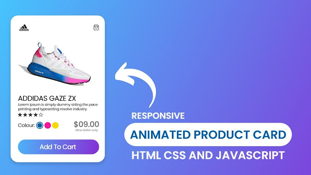
Hello guys, we are going to create an Animated Product Card using HTML CSS, and JavaScript. Before I have created lots of product card design by using HTML CSS, Animated Profile Cards is one of them but today we will add Little JavaScript too, and I sure that helps to make out Product Card Template more beautiful.
What is a Product Card?
A product card is a sample of the specific product from where the user can choose the product, product’s size, colour and designs as they need. Basically, product card on the webpages helps for users to find products for buying and for the company to sell.
Generally, on the product card design, we add any types details as we want but some major things we must add are:
- High-Resolution Image of Product
- Names and logo of the Product
- Price of the Product
- Add To Cart Button
- Colour and Sizes Option
The image of the Responsive Product Card that you are seen on the webpage is not only a design, but it is also an animated design. I mean that when I clicked on the colour option, the shoe colour changes according to the circle colour.
If you want to watch the real demo of Responsive with Animated Product Card, I highly recommend you to watch the given tutorial of this product card. And another benefit of watching the video tutorial is that you could get an idea of all the codes that I have used on this product card design.
Animated Product Card HTML CSS and JavaScript | Video Tutorial
As you have seen on the video tutorial of Responsive ANimated Product Card using HTML CSS and JavaSCript. I have added all the major things that are needed in a basic product card design. The main thing that makes this product card more beautiful is the colour changes when we click on the colour option. And we can get that which colour option is active isn’t it?
Actually to make the colour options button active and to change the shoe colour, I have used a little touch of JavaScript. Otherwise, UI design can be made with only HTML and CSS.
In my personal experience, following codes from the video tutorial helps to boost your knowledge and experience better rather than by copying or downloading codes. If you want to get the code of this product card design with animation. I have provided all source code below.
You May Like This:
Product Card HTML CSS | Free Source Code
To copy the following codes of our Responsive Animated Product Card that I have given below, you need to create two files, one is an HTML file and another is a CSS file. After creating these two files then you can copy-paste the following codes in your document.
Create a file with the name index.html on your computer and copy-paste the given HTML codes in your document.
<!DOCTYPE html>
<!-- Coding by CodingNepal | www.codingnepalweb.com -->
<html lang="en" dir="ltr">
  <head>
    <meta charset="UTF-8">
    <title> Responsive Animated Product Card | CodingLab </title>
    <link rel="stylesheet" href="style.css">
    <!-- Boxicons CDN Link -->
    <link href='https://unpkg.com/[email protected]/css/boxicons.min.css' rel='stylesheet'>
     <meta name="viewport" content="width=device-width, initial-scale=1.0">
   </head>
<body>
  <div class="product-card">
    <div class="logo-cart">
      <!--<img src="images/logo.jpg" alt="logo">-->
      <i class='bx bx-shopping-bag'></i>
    </div>
    <div class="main-images">
      <img id="blue" class="blue active" src="images/blue.png" alt="blue">
      <img id="pink" class="pink" src="images/pink.png" alt="blue">
      <img id="yellow" class="yellow" src="images/yellow.png" alt="blue">
    </div>
    <div class="shoe-details">
      <span class="shoe_name">ADDIDAS GAZE ZX</span>
      <p>Lorem ipsum dolor sit lorenm i amet, consectetur adipisicing elit. Eum, ea, ducimus!</p>
      <div class="stars">
        <i class='bx bxs-star' ></i>
        <i class='bx bxs-star' ></i>
        <i class='bx bxs-star' ></i>
        <i class='bx bxs-star' ></i>
        <i class='bx bx-star' ></i>
      </div>
    </div>
    <div class="color-price">
      <div class="color-option">
        <span class="color">Colour:</span>
        <div class="circles">
          <span class="circle blue active"  id="blue"></span>
          <span class="circle pink " id="pink"></span>
          <span class="circle yellow " id="yellow"></span>
        </div>
      </div>
      <div class="price">
        <span class="price_num">$09.00</span>
        <span class="price_letter">Nine dollar only</span>
      </div>
    </div>
    <div class="button">
      <div class="button-layer"></div>
      <button>Add To Cart</button>
    </div>
  </div>
  <script>
   let circle = document.querySelector(".color-option");

   circle.addEventListener("click", (e)=>{
     let target = e.target;
     if(target.classList.contains("circle")){
       circle.querySelector(".active").classList.remove("active");
       target.classList.add("active");
       document.querySelector(".main-images .active").classList.remove("active");
       document.querySelector(`.main-images .${target.id}`).classList.add("active");
     }
   });
  </script>
</body>
</html>
Create a file with the name styel.css on your computer and copy-paste the given CSS codes in your document.
/* Google Fonts Poppins */
@import url('https://fonts.googleapis.com/css2?family=Poppins:wght@400;500;600&display=swap');
*{
  margin: 0;
  padding: 0;
  box-sizing: border-box;
  font-family: 'Poppins', sans-serif;
}

body{
  height: 100vh;
  display: flex;
  align-items: center;
  justify-content: center;
  background-image: linear-gradient(135deg, #43CBFF 10%, #9708CC 100%);
}
.product-card {
  position: relative;
  max-width: 355px;
  width: 100%;
  border-radius: 25px;
  padding: 20px 30px 30px 30px;
  background: #fff;
  box-shadow: 0 5px 10px rgba(0, 0, 0, 0.2);
  z-index: 3;
  overflow: hidden;
}
.product-card .logo-cart{
  display: flex;
  align-items: center;
  justify-content: space-between;
}
.product-card .logo-cart img{
  height: 60px;
  width: 60px;
  object-fit: cover;
}
.product-card .logo-cart i{
  font-size: 27px;
  color: #707070;
  cursor: pointer;
  transition: color 0.3s ease;
}
.product-card .logo-cart i:hover{
  color: #333;
}
.product-card .main-images{
  position: relative;
  height: 210px;
}
.product-card .main-images img{
  position: absolute;
  height: 300px;
  width: 300px;
  object-fit: cover;
  transform: rotate(18deg);
  left: 12px;
  top: -40px;
  z-index: -1;
  opacity: 0;
  transition: opacity 0.5s ease;
}
.product-card .main-images img.active{
  opacity: 1;
}
.product-card .shoe-details .shoe_name{
  font-size: 24px;
  font-weight: 500;
  color: #161616;
}
.product-card .shoe-details p{
  font-size: 12px;
  font-weight: 400;
  color: #333;
  text-align: justify;
}
.product-card .shoe-details .stars i{
  margin: 0 -1px;
  color: #333;
}
.product-card .color-price .color-option{
  display: flex;
  align-items: center;
}
.color-price{
  display: flex;
  justify-content: space-between;
  align-items: center;
  margin-top: 10px;
}
.color-price .color-option .color{
  font-size: 18px;
  font-weight: 500;
  color: #333;
  margin-right: 8px;
}
.color-option  .circles{
  display: flex;
}
.color-option  .circles .circle{
  height: 18px;
  width: 18px;
  background: #0071C7;
  border-radius: 50%;
  margin: 0 4px;
  cursor: pointer;
  transition: all 0.4s ease;
}
.color-option  .circles .circle.blue.active{
  box-shadow: 0 0 0 2px #fff,
               0 0 0 4px #0071C7;
}
.color-option  .circles .circle.pink{
  background: #FA1795;
}
.color-option  .circles .circle.pink.active{
  box-shadow: 0 0 0 2px #fff,
               0 0 0 4px #FA1795;
}
.color-option  .circles .circle.yellow{
  background: #F5DA00;
}
.color-option  .circles .circle.yellow.active{
  box-shadow: 0 0 0 2px #fff,
               0 0 0 4px #F5DA00;
}
.color-price .price{
  display: flex;
  flex-direction: column;
  justify-content: center;
  align-items: center;
}
.color-price .price .price_num{
  font-size: 25px;
  font-weight: 600;
  color: #707070;
}
.color-price .price .price_letter{
  font-size: 10px;
  font-weight: 600;
  margin-top: -4px;
  color: #707070;
}
.product-card .button{
  position: relative;
  height: 50px;
  width: 100%;
  border-radius: 25px;
  margin-top: 30px;
  overflow: hidden;
}
.product-card .button .button-layer{
  position: absolute;
  height: 100%;
  width: 300%;
  left: -100%;
  background-image: linear-gradient(135deg,#9708CC, #43CBFF,#9708CC, #43CBFF );
  transition: all 0.4s ease;
  border-radius: 25PX;
}
.product-card .button:hover .button-layer{
  left: 0;
}
.product-card .button button{
  position: relative;
  height: 100%;
  width: 100%;
  background: none;
  outline: none;
  border: none;
  font-size: 18px;
  font-weight: 600;
  letter-spacing: 1px;
  color: #fff;
}
If you face any difficulties while creating your Animated Product Card or your code is not working as expected, you can download the source code files for this Product Card with Color Switcher for free by clicking on the download button, and you can also view a live demo of this card slider by clicking on the view live button.


from wher i can get img and other sorc cod
how to add another card just below the first card?
great
but i have 1 question :
If there are 2 or more tags, can this code be used and if not, please give me a solution.
Because I'm new to JavaScript so I don't know much
hope you reply soon:))))