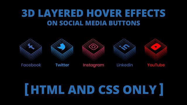
Hello readers, Today in this blog you’ll learn how to create 3D Layered Hover Effect on Social Media Buttons using only HTML & CSS. Earlier I have shared CSS3 – Neumorphism Social Media Buttons. Now it’s time to create 3D Layered Hover Effects on Social Media Buttons.
These social media links and buttons allow your website visitors and content viewers to easily share your content with their social media connections and networks. A social media share link is a URL that when clicked populates a fixed message and image that can be shared on social media.
Today in this blog I’ll share with you this program about Social Media Buttons with 3D Layered Hover Effects. At first, on the webpage, these buttons are in the initial stage where there is no 3D Layered effect, and icon names are also hidden at first. But when you hover on the particular social icon then that icon rotates and visible the layers of icons that visualize 3D Effect as well as texts, are also visible with sliding down.
If you’re feeling difficult to understand what I am saying. You can watch a full video tutorial on this program (CSS3 – 3D Layered Hover Effect on Social Media Buttons).
Video Tutorial of 3D Layered Hover Effect on Buttons
If you’re a beginner and you have basic knowledge of HTML & CSS then you can also create these types of effects. As you know, when you clicked on a particular Social Media Button it won’t redirect you to related sites. If you want to redirect the user on the particular website when he/she clicked on the buttons then simply insert the website link inside the href attribute of an anchor tag.
If you like this program (CSS3 – 3D Layered Hover Effect on Social Media Buttons) and want to get source codes. You can easily get the source codes of this program. To get the source codes you just need to scroll down.
CSS3 – 3D Layered Hover Effect [Source Codes].
To create this program (CSS3 – 3D Layered Hover Effect on Social Media Buttons). First, you need to create two Files one HTML File and another one is CSS File. After creating these files just paste the following codes in your file.
First, create an HTML file with the name of index.html and paste the given codes in your HTML file. Remember, you’ve to create a file with .html extension.
<!DOCTYPE html>
<!-- Created By CodingNepal -->
<html lang="en" dir="ltr">
   <head>
      <meta charset="utf-8">
      <title>3D Layered Hover Effect | CodingNepal</title>
      <link rel="stylesheet" href="style.css">
      <link rel="stylesheet" href="https://cdnjs.cloudflare.com/ajax/libs/font-awesome/5.15.3/css/all.min.css"/>
   </head>
   <body>
      <div class="icons">
         <a href="#">
            <div class="layer">
               <span></span>
               <span></span>
               <span></span>
               <span></span>
               <span class="fab fa-facebook-f"></span>
            </div>
            <div class="text">
               Facebook
            </div>
         </a>
         <a href="#">
            <div class="layer">
               <span></span>
               <span></span>
               <span></span>
               <span></span>
               <span class="fab fa-twitter"></span>
            </div>
            <div class="text">
               Twitter
            </div>
         </a>
         <a href="#">
            <div class="layer">
               <span></span>
               <span></span>
               <span></span>
               <span></span>
               <span class="fab fa-instagram"></span>
            </div>
            <div class="text">
               Instagram
            </div>
         </a>
         <a href="#">
            <div class="layer">
               <span></span>
               <span></span>
               <span></span>
               <span></span>
               <span class="fab fa-linkedin-in"></span>
            </div>
            <div class="text">
               Linkedin
            </div>
         </a>
         <a href="#">
            <div class="layer">
               <span></span>
               <span></span>
               <span></span>
               <span></span>
               <span class="fab fa-youtube"></span>
            </div>
            <div class="text">
               YouTube
            </div>
         </a>
      </div>
   </body>
</html>
Second, create a CSS file with the name of style.css and paste the given codes in your CSS file. Remember, you’ve to create a file with .css extension.
@import url('https://fonts.googleapis.com/css?family=Poppins:400,500,600,700&display=swap');
*{
  margin: 0;
  padding: 0;
  box-sizing: border-box;
  font-family: 'Poppins', sans-serif;
}
html,body{
  display: grid;
  height: 100%;
  place-items: center;
  background: #000;
}
.icons{
  display: inline-flex;
}
.icons a{
  margin: 0 25px;
  text-decoration: none;
  color: #fff;
  display: block;
  position: relative;
}
.icons a .layer{
  width: 55px;
  height: 55px;
  transition: transform 0.3s;
}
.icons a:hover .layer{
  transform: rotate(-35deg) skew(20deg);
}
.icons a .layer span{
  position: absolute;
  top: 0;
  left: 0;
  height: 100%;
  width: 100%;
  border: 1px solid #fff;
  border-radius: 5px;
  transition: all 0.3s;
}
.icons a .layer span.fab{
  font-size: 30px;
  line-height: 55px;
  text-align: center;
}
.icons a:hover .layer span:nth-child(1){
  opacity: 0.2;
}
.icons a:hover .layer span:nth-child(2){
  opacity: 0.4;
  transform: translate(5px, -5px);
}
.icons a:hover .layer span:nth-child(3){
  opacity: 0.6;
  transform: translate(10px, -10px);
}
.icons a:hover .layer span:nth-child(4){
  opacity: 0.8;
  transform: translate(15px, -15px);
}
.icons a:hover .layer span:nth-child(5){
  opacity: 1;
  transform: translate(20px, -20px);
}
.icons a:nth-child(1) .layer span,
.icons a:nth-child(1) .text{
  color: #4267B2;
  border-color: #4267B2;
}
.icons a:nth-child(2) .layer span,
.icons a:nth-child(2) .text{
  color: #1DA1F2;
  border-color: #1DA1F2;
}
.icons a:nth-child(3) .layer span,
.icons a:nth-child(3) .text{
  color: #E1306C;
  border-color: #E1306C;
}
.icons a:nth-child(4) .layer span,
.icons a:nth-child(4) .text{
  color: #2867B2;
  border-color: #2867B2;
}
.icons a:nth-child(5) .layer span,
.icons a:nth-child(5) .text{
  color: #ff0000;
  border-color: #ff0000;
}
.icons a:hover:nth-child(1) .layer span{
  box-shadow: -1px 1px 3px #4267B2;
}
.icons a:hover:nth-child(2) .layer span{
  box-shadow: -1px 1px 3px #1DA1F2;
}
.icons a:hover:nth-child(3) .layer span{
  box-shadow: -1px 1px 3px #E1306C;
}
.icons a:hover:nth-child(4) .layer span{
  box-shadow: -1px 1px 3px #2867B2;
}
.icons a:hover:nth-child(5) .layer span{
  box-shadow: -1px 1px 3px #ff0000;
}
.icons a .text{
  position: absolute;
  left: 50%;
  bottom: -5px;
  opacity: 0;
  font-weight: 500;
  transform: translateX(-50%);
  transition: bottom 0.3s ease, opacity 0.3s ease;
}
.icons a:hover .text{
  bottom: -35px;
  opacity: 1;
}
That’s all, now you’ve successfully created a CSS3 – 3D Layered Hover Effect on Social Media Buttons. If your code not work or you’ve faced any error/problem then please comment down or contact us from the contact page.


Thank you sir
Hi, Love your work, out of this world, thank you
I have one question though, i set this up, put changed one of the settings to "fab fa-envelope" it left the icon empty but put 3 small envelopes around it. If there a better name to get an email icon? ( i tried that too but with the same result)
Thank you