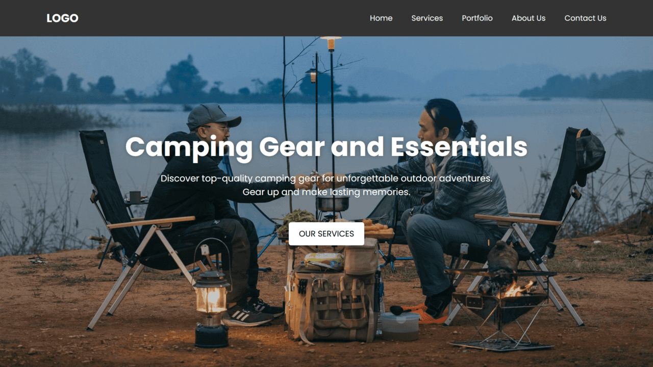
In today’s digital landscape, a well-designed and user-friendly website is essential for establishing an online presence. So, as a beginner web developer, it’s important to learn how to create responsive custom websites using HTML and CSS.
In this blog post, we’ll guide you through building your responsive custom website using HTML and CSS. Our example website will focus on camping gear and highlight sellers of essential equipment. You can also choose a different theme and customize it to your liking.
The website consists of key sections: Home, Services, Portfolio, About Us, Contact Us and Footer. Each section is fully responsive, adapting seamlessly to different screen sizes. On smaller devices, a hamburger menu provides convenient toggling of the menu visibility.
The Home section serves as the landing page with a navigation bar, captivating background image, descriptive text, and a call-to-action button. Services are showcased in visually appealing cards, while the Portfolio section displays accomplished projects through captivating image cards.
The About Us section shares the website’s story, mission, vision, and team details. Contact Us provides contact information and a user-friendly form for email, phone number, and messages. The footer section includes a copyright message and additional navigation links.
Video Tutorial of Custom Website in HTML and CSS
Steps For Creating Custom Website in HTML and CSS
To create a responsive custom website using HTML and CSS, follow the given steps line by line:
- Create a folder. You can name this folder whatever you want, and inside this folder, create the mentioned files.
- Create an
index.htmlfile. The file name must be index and its extension .html - Create a
style.cssfile. The file name must be style and its extension .css - Download and place the images folder in your project directory for the custom website. You can also use your own images if desired.
To start, add the following HTML codes to your index.html file: These codes include all the necessary CDN links, website layout, and different sections. Here you can change the website details according to your theme.
<!DOCTYPE html>
<!-- Coding By CodingNepal - www.codingnepalweb.com -->
<html lang="en">
  <head>
    <meta charset="UTF-8" />
    <meta name="viewport" content="width=device-width, initial-scale=1.0">
    <title>Camping Gear Website | CodingNepal</title>
    <link rel="stylesheet" href="style.css">
    <!-- Fontawesome Link for Icons -->
    <link rel="stylesheet" href="https://cdnjs.cloudflare.com/ajax/libs/font-awesome/6.3.0/css/all.min.css">
  </head>
  <body>
    <header>
      <nav class="navbar">
        <h2 class="logo"><a href="#">LOGO</a></h2>
        <input type="checkbox" id="menu-toggler">
        <label for="menu-toggler" id="hamburger-btn">
          <svg xmlns="http://www.w3.org/2000/svg" viewBox="0 0 24 24" fill="white" width="24px" height="24px">
            <path d="M0 0h24v24H0z" fill="none"/>
            <path d="M3 18h18v-2H3v2zm0-5h18V11H3v2zm0-7v2h18V6H3z"/>
          </svg>
        </label>
        <ul class="all-links">
          <li><a href="#home">Home</a></li>
          <li><a href="#services">Services</a></li>
          <li><a href="#portfolio">Portfolio</a></li>
          <li><a href="#about">About Us</a></li>
          <li><a href="#contact">Contact Us</a></li>
        </ul>
      </nav>
    </header>

    <section class="homepage" id="home">
      <div class="content">
        <div class="text">
          <h1>Camping Gear and Essentials</h1>
          <p>
            Discover top-quality camping gear for unforgettable outdoor adventures. <br> Gear up and make lasting memories.</p>
        </div>
        <a href="#services">Our Services</a>
      </div>
    </section>

    <section class="services" id="services">
      <h2>Our Services</h2>
      <p>Explore our wide range of camping gear services.</p>
      <ul class="cards">
        <li class="card">
          <img src="images/tents.jpg" alt="img">
          <h3>Tents</h3>
          <p>Experience comfort and protection with our high-quality camping tents.</p>
        </li>
        <li class="card">
          <img src="images/bags.jpg" alt="img">
          <h3>Sleeping Bags</h3>
          <p>Stay cozy and warm during your camping trips with our premium sleeping bags.</p>
        </li>
        <li class="card">
          <img src="images/stoves.jpg" alt="img">
          <h3>Camp Stoves</h3>
          <p>Cook delicious meals in the great outdoors with our reliable camp stoves.</p>
        </li>
        <li class="card">
          <img src="images/backpacks.jpg" alt="img">
          <h3>Backpacks</h3>
          <p>Carry your essentials comfortably with our durable and functional camping backpacks.</p>
        </li>
        <li class="card">
          <img src="images/chair.jpg" alt="img">
          <h3>Camp Chairs</h3>
          <p>Relax and unwind in style with our comfortable and portable camping chairs.</p>
        </li>
        <li class="card">
          <img src="images/light.jpg" alt="img">
          <h3>Camp Lights</h3>
          <p>Illuminate your campsite with our reliable and energy-efficient camping lights.</p>
        </li>
      </ul>
    </section>

    <section class="portfolio" id="portfolio">
      <h2>Our Portfolio</h2>
      <p>Take a look at some of our memorable camping adventures.</p>
      <ul class="cards">
        <li class="card">
          <img src="images/camping-1.jpg" alt="img">
          <h3>Mountain Hiking</h3>
          <p>Embark on an exhilarating hiking adventure in the breathtaking mountain ranges.</p>
        </li>
        <li class="card">
          <img src="images/camping-2.jpg" alt="img">
          <h3>Lakeside Camping</h3>
          <p>Enjoy a tranquil camping experience by the serene shores of picturesque lakes.</p>
        </li>
        <li class="card">
          <img src="images/camping-3.jpg" alt="img">
          <h3>Beach Camping</h3>
          <p>Escape to sandy beaches and camp under the starry sky by the crashing waves.</p>
        </li>
        <li class="card">
          <img src="images/camping-4.jpg" alt="img">
          <h3>Forest Exploration</h3>
          <p>Discover the wonders of lush forests and immerse yourself in nature's beauty.</p>
        </li>
        <li class="card">
          <img src="images/camping-5.jpg" alt="img">
          <h3>RV Camping</h3>
          <p>Experience the freedom of road trips and camping adventures with our RV rentals.</p>
        </li>
        <li class="card">
          <img src="images/camping-6.jpg" alt="img">
          <h3>Desert Camping</h3>
          <p>Embark on a unique desert camping experience and witness stunning landscapes.</p>
        </li>
      </ul>
    </section>

    <section class="about" id="about">
      <h2>About Us</h2>
      <p>Discover our story in providing camping services.</p>
      <div class="row company-info">
        <h3>Our Story</h3>
        <p>Experience the excellence of our camping gear and services, where we have been offering high-quality camping essentials and gear for outdoor enthusiasts for over a decade. Our commitment to quality and customer satisfaction ensures that every adventurer can rely on us for their camping needs.</p>
      </div>
      <div class="row mission-vision">
        <h3>Our Mission</h3>
        <p>At Camping Gear Experts, our mission is to equip outdoor enthusiasts with top-notch camping gear and essentials that enhance their outdoor experiences. We strive to provide reliable, durable, and innovative products that contribute to memorable adventures and lasting memories.</p>
        <h3>Our Vision</h3>
        <p>Our vision is to become the go-to destination for camping enthusiasts, known for our extensive selection of premium camping gear and exceptional customer service. We aspire to inspire and enable people to embrace the beauty of nature and create unforgettable camping experiences.</p>
      </div>
      <div class="row team">
        <h3>Our Team</h3>
        <ul>
          <li>John Doe - Founder and CEO</li>
          <li>Jane Smith - Gear Specialist</li>
          <li>Mark Johnson - Customer Representative</li>
          <li>Sarah Brown - Operations Manager</li>
        </ul>
      </div>
    </section>

    <section class="contact" id="contact">
      <h2>Contact Us</h2>
      <p>Reach out to us for any inquiries or feedback.</p>
      <div class="row">
        <div class="col information">
          <div class="contact-details">
            <p><i class="fas fa-map-marker-alt"></i> 123 Campsite Avenue, Wilderness, CA 98765</p>
            <p><i class="fas fa-envelope"></i> [email protected]</p>
            <p><i class="fas fa-phone"></i> (123) 456-7890</p>
            <p><i class="fas fa-clock"></i> Monday - Friday: 9:00 AM - 5:00 PM</p>
            <p><i class="fas fa-clock"></i> Saturday: 10:00 AM - 3:00 PM</p>
            <p><i class="fas fa-clock"></i> Sunday: Closed</p>
            <p><i class="fas fa-globe"></i> www.codingnepalweb.com</p>
          </div>
        </div>
        <div class="col form">
          <form>
            <input type="text" placeholder="Name*" required>
            <input type="email" placeholder="Email*" required>
            <textarea placeholder="Message*" required></textarea>
            <button id="submit" type="submit">Send Message</button>
          </form>
        </div>
      </div>
    </section>

    <footer>
      <div>
        <span>Copyright © 2023 All Rights Reserved</span>
        <span class="link">
            <a href="#">Home</a>
            <a href="#contact">Contact</a>
        </span>
      </div>
    </footer>

  </body>
</html>
Next, add the following CSS codes to your style.css file to apply styling to the elements, set background images, and utilize media queries for responsiveness across different viewports. Feel free to customize this code by changing the color, font, size, and other CSS properties to match your desired design preferences.
@import url("https://fonts.googleapis.com/css2?family=Poppins:wght@200;300;400;500;600;700&display=swap");

* {
  margin: 0;
  padding: 0;
  box-sizing: border-box;
  font-family: "Poppins", sans-serif;
}

html {
  scroll-behavior: smooth;
}

body {
  background: #f2f2f2;
}

header {
  position: fixed;
  top: 0;
  left: 0;
  z-index: 5;
  width: 100%;
  display: flex;
  justify-content: center;
  background: #333;
}

.navbar {
  display: flex;
  padding: 0 10px;
  max-width: 1200px;
  width: 100%;
  align-items: center;
  justify-content: space-between;
}

.navbar input#menu-toggler {
  display: none;
}

.navbar #hamburger-btn {
  cursor: pointer;
  display: none;
}

.navbar .all-links {
  display: flex;
  align-items: center;
}

.navbar .all-links li {
  position: relative;
  list-style: none;
}

.navbar .logo a {
  display: flex;
  align-items: center;
  margin-left: 0;
}

header a, footer a {
  margin-left: 40px;
  text-decoration: none;
  color: #fff;
  height: 100%;
  padding: 20px 0;
  display: inline-block;
}

header a:hover, footer a:hover {
  color: #ddd;
}

.homepage {
  height: 100vh;
  width: 100%;
  position: relative;
  background: url("images/home-bg.jpg");
  background-position: center 65%;
  background-size: cover;
  background-attachment: fixed;
}

.homepage::before {
  content: "";
  position: absolute;
  left: 0;
  top: 0;
  height: 100%;
  width: 100%;
  background: rgba(0, 0, 0, 0.2);
}

.homepage .content {
  display: flex;
  height: 85%;
  z-index: 3;
  align-items: center;
  justify-content: center;
  flex-direction: column;
}

.homepage .content h1 {
  font-size: 60px;
  font-weight: 700;
  margin-bottom: 10px;
}

.homepage .content .text {
  margin-bottom: 50px;
  color: #fff;
  font-size: 20px;
  text-align: center;
  text-shadow: 0px 0px 10px rgba(0, 0, 0, 0.3);
}

.content a {
  color: #000;
  display: block;
  text-transform: uppercase;
  font-size: 18px;
  margin: 0 10px;
  padding: 10px 30px;
  border-radius: 5px;
  background: #fff;
  border: 2px solid #fff;
  transition: 0.4s ease;
  box-shadow: 0 10px 20px rgba(0, 0, 0, 0.3);
  text-decoration: none;
}

.content a:hover {
  color: #fff;
  background: rgba(255,255,255,0.3);
}

section {
  display: flex;
  align-items: center;
  flex-direction: column;
  padding: 80px 0 0;
}

section h2 {
  font-size: 2rem;
}

section > p {
  text-align: center;
}

section .cards {
  display: flex;
  flex-wrap: wrap;
  max-width: 1200px;
  margin-top: 50px;
  padding: 0 10px;
  justify-content: space-between;
}

section.about {
  margin: 0 auto;
  max-width: 1200px;
}

.about .company-info {
  margin-top: 30px;
}

.about h3 {
  margin: 30px 0 10px;
}

.about .team {
  text-align: left;
  width: 100%;
}

.about .team ul {
  padding-left: 20px;
}

section .cards .card {
  background: #fff;
  padding: 40px 15px;
  list-style: none;
  border-radius: 5px;
  box-shadow: 0px 5px 10px rgba(0, 0, 0, 0.04);
  margin-bottom: 40px;
  width: calc(100% / 3 - 30px);
  text-align: center;
}

.portfolio .cards .card {
  padding: 0 0 20px;
}

.services .card img {
  width: 120px;
  height: 120px;
  margin-bottom: 20px;
  border-radius: 100%;
  object-fit: cover;
}

.portfolio .card img {
  width: 100%;
  padding-bottom: 10px;
  aspect-ratio: 16 / 9;
  object-fit: cover;
  border-radius: 7px;
}

.cards .card p {
  padding: 0 15px;
  margin-top: 5px;
}

.about .row {
  padding: 0 10px;
}

.contact .row {
  margin: 60px 0 90px;
  display: flex;
  max-width: 1200px;
  width: 100%;
  align-items: center;
  justify-content: space-between;
}

.contact .row .col {
  padding: 0 10px;
  width: calc(100% / 2 - 50px);
}

.contact .col p {
  margin-bottom: 10px;
}

.contact .col p i {
  color: #7a7a7a;
  margin-right: 10px;
}

.contact form input {
  height: 45px;
  margin-bottom: 20px;
  padding: 10px;
  width: 100%;
  font-size: 16px;
  outline: none;
  border: 1px solid #bfbfbf;
}

.contact form textarea {
  padding: 10px;
  width: 100%;
  font-size: 16px;
  height: 150px;
  outline: none;
  resize: vertical;
  border: 1px solid #bfbfbf;
}

.contact form button {
  margin-top: 10px;
  padding: 10px 20px;
  font-size: 17px;
  color: #fff;
  border: none;
  cursor: pointer;
  border-radius: 5px;
  background: #333;
  transition: 0.2s ease;
}

.contact form button:hover {
  background: #525252;
}

footer {
  width: 100%;
  display: flex;
  justify-content: center;
  background: #000;
  padding: 20px 0;
}

footer div {
  padding: 0 10px;
  max-width: 1200px;
  width: 100%;
  display: flex;
  justify-content: space-between;
}

footer span {
  color: #fff;
}

footer a {
  padding: 0;
}

@media screen and (max-width: 860px) {
  .navbar .all-links {
    position: fixed;
    left: -100%;
    width: 300px;
    display: block;
    height: 100vh;
    top: 75px;
    background: #333;
    transition: left 0.3s ease;
  }

  .navbar #menu-toggler:checked~.all-links {
    left: 0;
  }

  .navbar .all-links li {
    font-size: 18px;
  }

  .navbar #hamburger-btn {
    display: block;
  }

  section > p {
    text-align: center;
  }

  section .cards .card {
    width: calc(100% / 2 - 15px);
    margin-bottom: 30px;
  }

  .homepage .content h1 {
    font-size: 40px;
    font-weight: 700;
    margin-bottom: 10px;
  }

  .homepage .content .text {
    font-size: 17px;
  }

  .content a {
    font-size: 17px;
    padding: 9px 20px;
  }

  .contact .row {
    flex-direction: column;
  }

  .contact .row .col {
    width: 100%;
  }

  .contact .row .col:last-child {
    margin-top: 40px;
  }

  footer a {
    height: 0;
  }
}

@media screen and (max-width: 560px) {
  section .cards .card {
    width: 100%;
    margin-bottom: 30px;
  }
}
If you look at the HTML and CSS code carefully, you’ll notice the implementation of the input type checkbox, which effectively toggles the visibility of the navigation bar when the hamburger icon is clicked. The website’s code is thoughtfully organized and straightforward, making it easily understandable, especially for beginners.
Conclusion and Final Words
In conclusion, learning how to create a responsive custom website using HTML and CSS enhances your web development skills and provides insight into the process of building a custom website. By following the instructions provided, I hope that you have successfully created an appealing and functional website.
Additionally, on this website, you’ll find a wide range of website templates, including options for business websites, portfolio websites, and more. These templates are built using HTML, CSS, and JavaScript. It’s a great opportunity for you to explore and try recreating them, allowing you to enhance your web development skills even further.
If you encounter any difficulties while creating your own custom website or your code is not working as expected, you can download the source code files for this camping gear theme website for free by clicking the Download button. You can also view a live demo of it by clicking the View Live button.


realy impresing work here