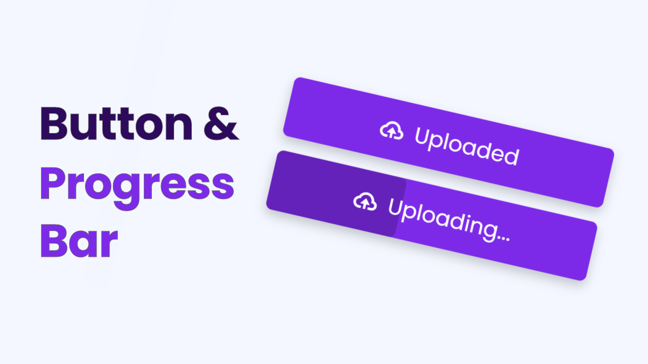
Hello friends, welcome to my other blog, today we are going to create a Button with progress in HTML CSS, and JavaScript. As you guys know earlier I have created a button ripple animation which you have loved so much. I hope this button with the progress bar program will be material content for you.
A progress bar is an animation that appears while the window, website, and other digital pages are going to open. The progressing bar or animation could be in different designs like in numbers, horizontal-vertical form, and circular form.
I have combined the progress bar animation inside the button as you can have a look, I have given on the webpage. Actually in this program [Button with progress bar in HTML CSS and JavaScript], at the first button, there is only one button and while we clicked on it progress bar starts and takes some time to complete. With the progress bar, we will see the changing texts of the button.
Let’s have a look at the real example of a button with progress. I highly recommend you to watch the full video tutorial then you will get an idea that how all codes are working perfectly on this program.
Video Tutorial of Button with Progress Bar
I have provided all the source code of this program[Button with Progress Bar in HTML CSS and JavaScript], Before jumping on the source code files, You have to know some important points of this program.
As you have seen in the video, at first we have seen one button with the text “Upload File” when I clicked on the button the progress bar starts appears from the left side and started to move at the right side, and the button’s text changes into the uploading” and when the progress bar completed button’s text change into “Uploaded”.
To make this progress bar animation I have used CSS animation property and to change the text I have used little JavaScript. Yeah, we could make this with only CSS code but we have to write code more that’s why rather than using the only CSS I went to JavaScript code.
I believe now you could make this program easily [Button with Progress Bar in HTML CSS and JavaScript], if you want to use the only CSS then you and done by HTML’s radio button. Those friends who are feeling difficulty building this progressing animation on the button then you can get all source code files below;
You Might Like This:
Button with Progress Bar [Source Code]
<!DOCTYPE html>
<!-- Coding By CodingNepal - codingnepalweb.com -->
<html lang="en" dir="ltr">
  <head>
    <meta charset="UTF-8">
     <title> Button with Progress Bar | CodingLab </title>
    <link rel="stylesheet" href="style.css">
    <!-- Boxiocns CDN Link -->
    <link href='https://unpkg.com/[email protected]/css/boxicons.min.css' rel='stylesheet'>
   </head>
<body>
  <div class="button ">
    <div class="text-icon">
      <i class="bx bx-cloud-upload"></i>
      <span class="text">Upload File</span>
    </div>
  </div>

  <script>
    const button = document.querySelector(".button"),
    text = document.querySelector(".text");

    button.addEventListener("click", ()=>{
      button.classList.add("progress");
      text.innerText = "Uploading...";

      setTimeout(()=>{
       button.classList.remove("progress"); //remove progress after 6s
       text.innerText = "Uploaded";
      },6000); //1000ms = 1s (6000 = 6s)

    });
  </script>

</body>
</html>
@import url('https://fonts.googleapis.com/css2?family=Poppins:wght@200;300;400;500;600;700&display=swap');
*{
  margin: 0;
  padding: 0;
  box-sizing: border-box;
  font-family: 'Poppins',sans-serif;
}
body{
  height: 100vh;
  display: flex;
  align-items: center;
  justify-content: center;
  background: #F4F7FF;
}
.button{
  position: relative;
  height: 55px;
  max-width: 300px;
  width: 100%;
  background: #7d2ae8;
  border-radius: 6px;
  cursor: pointer;
  box-shadow: 0 5px 10px rgba(0,0,0,0.2);
  overflow: hidden;
}
.button::before{
  content: "";
  position: absolute;
  top: 0;
  left: -100%;
  height: 100%;
  width: 100%;
  background: rgba(0,0,0,0.2);
  border-radius: 6px;
}
.button.progress::before{
  animation: progress 6s ease-in-out forwards;
}
@keyframes progress {
  0%{
    left: -100%;
  }
  10%{
    left: -97%;
  }
  20%{
    left: -92%;
  }
  30%{
    left: -82%;
  }
  30%{
    left: -62%;
  }
  40%{
    left: -38%;
  }
  50%{
    left: -18%;
  }
  60%{
    left: -14%;
  }
  80%{
    left: -7%;
  }
  90%{
    left: -3%;
  }
  100%{
    left: 0%;
  }
}
.button .text-icon{
  height: 100%;
  width: 100%;
  display: flex;
  align-items: center;
  justify-content: center;
}
.button .text-icon i,
.button .text-icon span{
  position: relative;
  color: #fff;
  font-size: 26px;
}
.button .text-icon span{
  font-size: 20px;
  font-weight: 400;
  margin-left: 8px;
}
If you face any difficulties while creating your Button with Progress Bar or your code is not working as expected, you can download the source code files for this Button and Progressing Bar for free by clicking on the download button, and you can also view a live demo of this card slider by clicking on the view live button.


Amazing Sir