Hello readers, today in this blog I’m going to create a Responsive Pricing Table using HTML & CSS. In my earlier blog. I have shared How to Create a Responsive Profile Card and now it’s time to create pricing tables.
Simply, pricing tables are the flat card designs of a particular product with products of different value and offer for the buyers. Pricing table can be a various product like mobile phones, television, hosting, and others. Basically, it is use maximum in the e-commerce website.
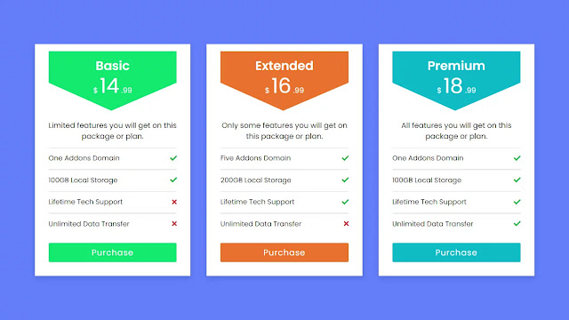
As you can see on the given image of this design [Responsive Pricing Tables], on the webpage. There are three cards of the price list with different colors, offers, and prices. Actually, this is the pricing table of the hosting. In detail in the top cards, there is the price of this product, the bottom of the price some major information for each value, the bottom of the information there are all offers which is given to users in different price segments. These all cards are responsive and also I have added some hover effects on the button.
If you are feeling confused about this program [Pricing Tables Design], then you can watch a full video tutorial of this program which is given below. I’m sure that all your confusion will clear and you will get all ideas of this program [Responsive Pricing Cards], after watching this video.
Full Video Tutorial of Responsive Pricing Table using HTML & CSS
As you have seen on the given video of this program [Price Cards]. At first, there are three cards on the screen of a different color. Every card has different price values for the same product, with the price range there offers and facilities are also differs. Also, you have seen these price cards are also responsive, and perfectly fits on every screen size.
To make responsive for this program [Price Cards Template], I have used a CSS media query. Have you notice that when I hovered on the button on the cards their color brightness increase smoothly, which looks like it is clicked.
If you have basic knowledge about HTML and CSS then you can easily build this program [Responsive Pricing Table], and also if you know JavaScript then you can add more functions as you want. Those friends who are feeling difficulty to make this program [Responsiv Pricing Cards], don’t worry have provided all source code files below.
You Might Like This:
Responsive Pricing Table [Source Codes]
To copy the give codes of this program [Pricing Card using HTML & CSS], first of all, you need to create two files on is HTML files and another is a CSS file, after creating these two files you can copy-paste all code in your files. You can also download all source code files from the given “Download Button”. I also recommend you to down all source code files rather than copy them.
<!DOCTYPE html>
<!-- Created By CodingLab - www.codinglabweb.com -->
<html lang="en" dir="ltr">
  <head>
    <meta charset="UTF-8">
    <title> Resonsive Pricing Table | CodingLab </title>
    <link rel="stylesheet" href="style.css">
    <link rel="stylesheet" href="https://cdnjs.cloudflare.com/ajax/libs/font-awesome/5.15.2/css/all.min.css"/>
     <meta name="viewport" content="width=device-width, initial-scale=1.0">
   </head>
<body>
    <div class="content">
      <div class="card one">
        <div class="top">
          <div class="title">Basic</div>
          <div class="price-sec">
            <span class="dollar">$</span>
            <span class="price">14</span>
            <span class="decimal">.99</span>
          </div>
        </div>
        <div class="info">Limited features you will get on this package or plan</div>
        <div class="details">
          <div class="one">
            <span>One Addons Domain</span>
            <i class="fas fa-check"></i>
          </div>
          <div class="one">
            <span>100GB Local Storage</span>
            <i class="fas fa-check"></i>
          </div>
          <div class="one">
            <span>Lifetime Tech Support</span>
            <i class="fas fa-times"></i>
          </div>
          <div class="one">
            <span>Unlimited Data Transfer</span>
            <i class="fas fa-times"></i>
          </div>
          <button>Purchase</button>
        </div>
      </div>
      <div class="card two">
        <div class="top">
          <div class="title">Extended</div>
          <div class="price-sec">
            <span class="dollar">$</span>
            <span class="price">16</span>
            <span class="decimal">.99</span>
          </div>
        </div>
        <div class="info">Only some features you will get on this package or plan</div>
        <div class="details">
          <div class="one">
            <span>Five Addons Domain</span>
            <i class="fas fa-check"></i>
          </div>
          <div class="one">
            <span>200GB Local Storage</span>
            <i class="fas fa-check"></i>
          </div>
          <div class="one">
            <span>Lifetime Tech Support</span>
            <i class="fas fa-check"></i>
          </div>
          <div class="one">
            <span>Unlimited Data Transfer</span>
            <i class="fas fa-times"></i>
          </div>
          <button>Purchase</button>
        </div>
      </div>
      <div class="card three">
        <div class="top">
          <div class="title">Premium</div>
          <div class="price-sec">
            <span class="dollar">$</span>
            <span class="price">18</span>
            <span class="decimal">.99</span>
          </div>
        </div>
        <div class="info">All features you will get on this package or plan</div>
        <div class="details">
          <div class="one">
            <span>10 Addons Domain</span>
            <i class="fas fa-check"></i>
          </div>
          <div class="one">
            <span>Unlimited Local Storage</span>
            <i class="fas fa-check"></i>
          </div>
          <div class="one">
            <span>Lifetime Tech Support</span>
            <i class="fas fa-check"></i>
          </div>
          <div class="one">
            <span>Unlimited Data Transfer</span>
            <i class="fas fa-check"></i>
          </div>
          <button>Purchase</button>
        </div>
      </div>
    </div>
</body>
</html>
@import url('https://fonts.googleapis.com/css2?family=Poppins:wght@200;300;400;500;600;700&display=swap');
*{
  margin: 0;
  padding: 0;
  box-sizing: border-box;
  font-family: 'Poppins',sans-serif;
}
body{
  min-height: 100vh;
  display: flex;
  align-items: center;
  justify-content: center;
  padding: 20px;
  background: #647df9;
}
.content{
  max-width: 1090px;
  width: 100%;
  margin: auto;
  display: flex;
  justify-content: space-between;
  flex-wrap: wrap;
}
 .content .card{
  background: #fff;
  width: calc(33% - 20px);
  text-align: center;
  padding: 15px 30px  30px 30px;
  box-shadow: 0 5px 10px rgba(0, 0, 0, 0.15);
}
.content .card .top{
  height: 130px;
  color: #fff;
  padding: 12px 0 0 0 ;
  clip-path: polygon(0 0, 100% 0, 100% 53%, 49% 100%, 0 53%);
}

.content .card .top .title{
 font-size: 27px;
 font-weight: 600;
}
.content .card .top .price-sec{
  margin-top: -10px;
  font-weight: 600;
}
.content .card .top .price{
  font-size: 45px;
}
.content .card .info{
  font-size: 16px;
  margin-top: 20px;
}
.content .card .details .one{
  margin-top: 25px;
  font-size: 15px;
  display: flex;
  justify-content: space-between;
  align-items: center;
  position: relative;
}
.content .card .details .one::before{
  position: absolute;
  content: "";
  width: 100%;
  background: #ddd;
  height: 1px;
  left: 0;
  top: -12px;
  border-radius: 25px;
}
.content .card .details .one i{
  color: #2db94d;
}
.content .card .details i.fa-times{
  color: #cd3241;
}
.content .card button{
  outline: none;
  border: none;
  height: 42px;
  color: #fff;
  margin-top: 30px;
  border-radius: 3px;
  font-size: 18px;
  width: 100%;
  display: block;
  transition: all 0.3s ease;
  cursor: pointer;
  letter-spacing: 1px;
}
.content .one .top,
.content .one button{
  background: #14eb6e;
}
.content .two .top,
.content .two button{
  background: #e87130;
}
.content .three .top,
.content .three button{
  background: #11BCC3;
}
.content button:hover {
  filter: brightness(90%);
}
.content .one ::selection{
background: #8af5b6;
}
.content .two ::selection{
background:  #f2b08c;
}
.content .three ::selection{
background: #d0f9fb;
}
@media (max-width:1000px) {
   .content .card{
    background: #fff;
    width: calc(50% - 20px);
    margin-bottom: 30px;
}
}
@media (max-width:715px) {
 .content .card{
    width: 100%;
}
}


