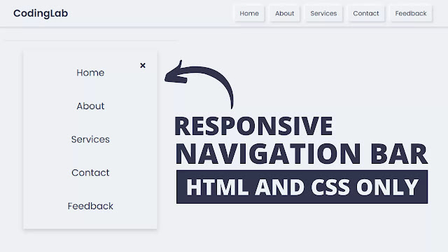
Hello friend, today in this blog I’m going to create a Responsive Neumorphism Navigation Bar using HTML & CSS only. In a previous blog, I have Shared How to Create a Transparent Sidebar Menu using HTML & CSS and now I’m going to create a navigation menu in neumorphism style using pure CSS.
What is a Neumorphism?
In this program Responsive Neumorphism Navigation Bar, on the webpage, there is a logo at the top left side and some navigation links at the top right side of the navigation bar. On pc, you will see the navigation menu align in horizontal form, and on mobile devices, you will see this navigation align in vertical form. I have used only HTML & CSS.
What is the CSS code for Neumorphism UI?
Important code for Neumorphism Ui are listed below. By adding following CSS code on the elements, we can create Neumorphism UI:
background: #ecf0f3;
box-shadow: -3px -3px 7px #ffffff,
3px 3px 5px #ceced1,
inset -3px -3px 7px #ffffff,
inset 3px 3px 5px #ceced1;
To make this navigation menu responsive I have used the @media property in the CSS file. With the help of @media property, I have made the webpage responsive for all devices like tablets, mobile, and other various size devices. If you are feeling difficulty understanding this responsive navigation bar then you can watch the full video tutorial.
Neumorphism Navigation Bar | Video Tutorial
In this video [ Responsive Navigation in Neumorphism UI], you have seen a fully responsive navbar, hope you have understood the basic codes to create this type of navigation menu. You have seen in the mobile devices the navigation links appear to align vertically. There is also a button that controls the navigation bar to show or hide. To make this button I have used HTML checkbox control with a label tag.
If you have basic knowledge about Html & CSS then you can easily make this neumorphism navbar also if you have knowledge about JavaScript you can add more functionality as your choice, this is free for all of you you can use this navbar as your purpose. Those friends who are feeling difficult to make this don’t worry if you like this program [Responsive Neumorphism Navigation Bar] and want full source code files I provide them below. You can use this navigation for your HTML, webpages, or other uses.
You Might Like This:
- Responsive Navigation Menu
- Neumorphism Sidebar Menu
- Animated Sidebar Menu Design
- Website Design HTML & CSS
Responsive Neumorphism Navigation Bar | Source Codes
To paste the given codes [Neumorphism Navbar], first of all, you need to create two HTML & CSS files you can copy-paste these codes in your files. If you are feeling confused you can also download the source code files from the given “download button”.
<!DOCTYPE html>
<!-- Created By CodingNepal - www.codingnepalweb.com -->
<html lang="en" dir="ltr">
  <head>
    <meta charset="UTF-8">
    <title> Neumorphism Sidebar Menu | CodingLab </title>
    <link rel="stylesheet" href="style.css">
    <link rel="stylesheet" href="https://cdnjs.cloudflare.com/ajax/libs/font-awesome/5.15.2/css/all.min.css"/>
   </head>
<body>
  <input type="checkbox" id="check">
  <label class="button bars" for="check"><i class="fas fa-bars"></i></label>
  <div class="side_bar">
    <div class="title">
      <div class="logo">CodingLab</div>
      <label class=" button cancel" for="check"><i class="fas fa-times"></i></label>
    </div>
    <ul>
          <li><a href="#"><i class="fas fa-qrcode"></i>Dashboard</a></li>
          <li><a href="#"><i class="fas fa-link"></i>Shortcuts</a></li>
          <li><a href="#"><i class="fas fa-stream"></i>Overview</a></li>
          <li><a href="#"><i class="fas fa-calendar-week"></i>Events</a></li>
          <li><a href="#"><i class="fas fa-question-circle"></i>About</a></li>
          <li><a href="#"><i class="fas fa-sliders-h"></i>Services</a></li>
          <li><a href="#"><i class="fas fa-phone-volume"></i>Contact</a></li>
          <li><a href="#"><i class="fas fa-comments"></i>Feedback</a></li>
        </ul>
        <div class="media_icons">
          <a href="#"><i class="fab fa-facebook-f"></i></a>
          <a href="#"><i class="fab fa-twitter"></i></a>
          <a href="#"><i class="fab fa-instagram"></i></a>
          <a href="#"><i class="fab fa-youtube"></i></a>
        </div>

  </div>
</body>
</html>
@import url('https://fonts.googleapis.com/css2?family=Poppins:wght@200;300;400;500;600;700&display=swap');
*{
  margin: 0;
  padding: 0;
  box-sizing: border-box;
  font-family: 'Poppins',sans-serif;
}
body{
  background: #ecf0f3;
}
nav{
  width: 100%;
  padding: 12px 0;
  background: #ecf0f3;
  box-shadow: -3px -3px 7px #ffffff,
             3px 3px 5px #ceced1,
             inset -3px -3px 7px #ffffff,
             inset 3px 3px 5px #ceced1;
}
nav .menu{
  max-width: 1270px;
  margin: auto;
  padding: 0 20px;
  display: flex;
  justify-content: space-between;
  align-items: center;
}
.menu .logo a{
  font-size: 28px;
  font-weight: 600;
  text-decoration: none;
  color: #31344b;
}
.menu ul{
  list-style: none;
  display: flex;
}
.menu ul a{
  margin:0 8px;
  text-decoration: none;
  font-size: 18px;
  color: #31344b;
  font-weight: 400;
  display: inline-flex;
  padding: 10px 12px;
 box-shadow: -3px -3px 7px #ffffff,
            3px 3px 5px #ceced1;
  position: relative;
  transition: all 0.3s ease;
}
.menu ul a:hover:before{
  content: '';
  position: absolute;
  top: 0;
  left: 0;
  right: 0;
  bottom: 0;
  box-shadow: inset -3px -3px 7px #ffffff,
              inset 3px 3px 5px #ceced1;
}
.center{
  position: absolute;
  top: 50%;
  left: 50%;
  width: 100%;
  transform: translate(-50%, -50%);
  text-align: center;
}
.upper{
  font-size: 40px;
  font-weight: 600;
  color: #31344b;
}
.lower{
  font-size: 40px;
  font-weight: 600;
  color: #31344b;
}
.menu ul a:hover{
  color: #3498db;
}
nav label.btn{
  color: #31344b;
  font-size: 18px;
  cursor: pointer;
  display: none;
}
nav label.cancel{
  position: absolute;
  top: 25px;
  right: 30px;
}
#check{
  display: none;
}
@media (max-width:940px) {
  .menu ul{
    display: block;
    position: fixed;
    top: 0;
    left: -100%;
    width: 100%;
    max-width: 400px;
    padding-top: 45px;
    height: 100%;
    background: #ecf0f3;
    box-shadow: 0 5px 10px #b0b0b5;
    z-index: 12;
    transition: all 0.3s ease;
  }
  .menu ul a{
   display: block;
   font-size: 23px;
   width: 100%;
   margin-top: 30px;
   box-shadow: none;
   text-align: center;
  }
  .menu ul a:hover:before{
    box-shadow: none;
  }
  nav label.bars{
    display: block;
  }
  #check:checked ~ label.bars{
    display: none;
  }
  #check:checked ~ ul label.cancel{
    display: block;
  }
  #check:checked ~ ul{
    left: 0;
  }
}
If you face any difficulties while creating your Responsive Neumorphism Navigation Bar or your code is not working as expected, you can download the source code files for this Neumorphism Navbar for free by clicking on the download button, and you can also view a live demo of this card slider by clicking on the view live button.


nah