Hello friend, I hope you are doing awesome. Today we are going to create the most useful elements that are added to the major side navigation bar and it is called Hamburger Menu with animation by using HTML CSS JavaScript. As you know recently I have created all types of Hamburger Menus.
Generally, Hamburger Menu or Hamburger Toggle button looks like hamburger food that we eat. This type of element is mostly used on the side navigation bar to open and close them.
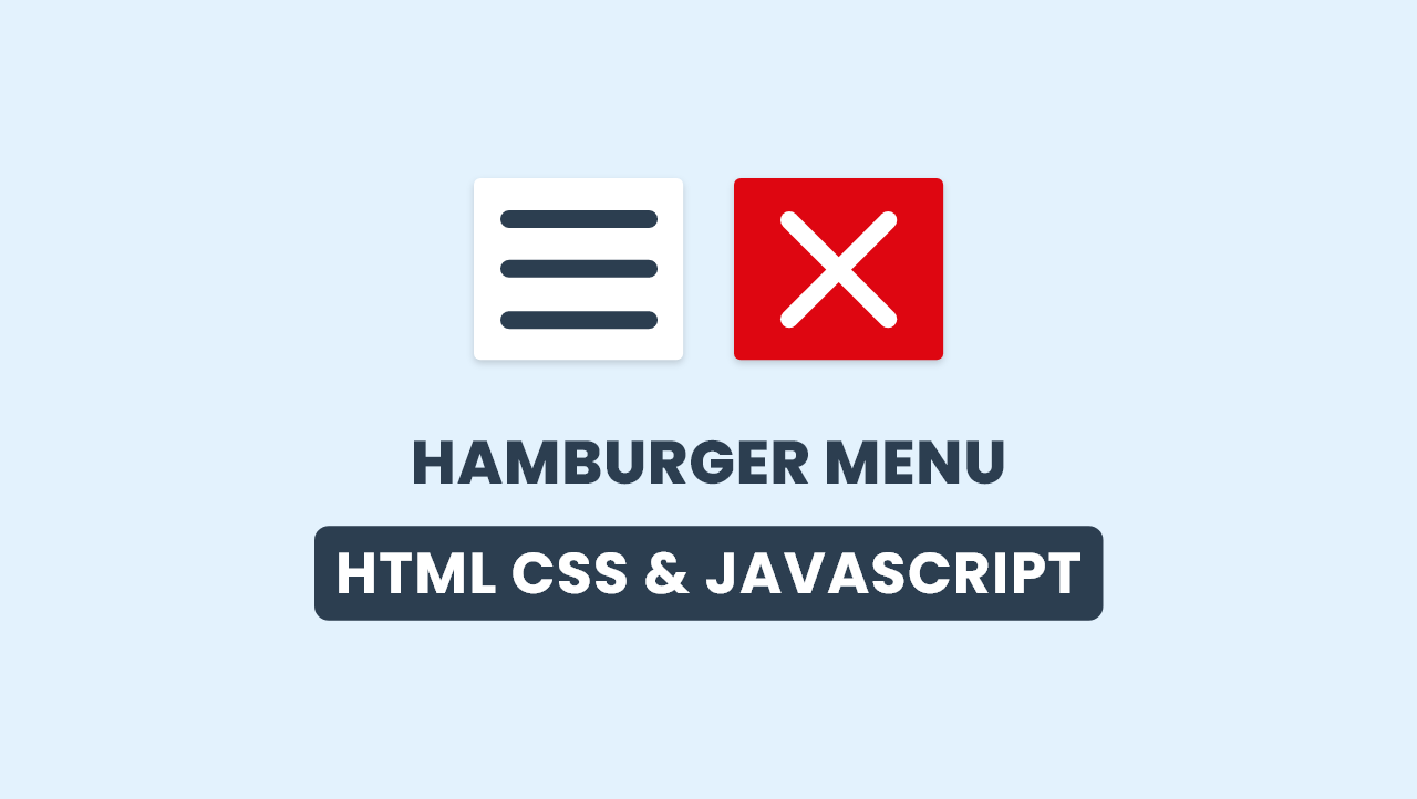
Let’s have a look at the given image of our Hamburger Menu. On the left side, you can see three-line inside the white box, which is called hamburger and when we click on it, those two lines change into a cross and one disappears, and also background changes with the beautiful animation.
Now we are going to watch the real demo of this project [Animated Hamburger Menu], and of course all the codes that I have used to create this hamburger menu and its animation.
Animated Hamburger Menu in HTML CSS JavaScript
I have provided all the HTML CSS and JavaScript source code that I have used to create this Hamburger Menu with Beautiful Animtion. Before jumping into the source, you need to know some basic points of this video tutorial.
As you have seen on the video tutorial of Animated Hamburger Menu. At first, we have seen three horizontal lines when I click on them, two lines converted into a cross sign and one line moves to the left side and disappears, and also background color changed to red from white. Same as, when I clicked on it again it turns into a hamburger. To make its UI/UX I have used HTML and CSS and to toggle it, I have used some JavaScript code. You can also make it toggles by using HTML Input’s checkbox.
I hope, now you have got all the ideas to created a Hamburger Menu with Animation. If you are feeling difficulty creating this project, I have provided all the source code files below.
You Might Like This:
Animated Hamburger Menu [Source Code]
<!DOCTYPE html>
<!-- Coding by CodingLab | www.codinglabweb.com -->
<html lang="en">
<head>
    <meta charset="UTF-8">
    <meta http-equiv="X-UA-Compatible" content="IE=edge">
    <meta name="viewport" content="width=device-width, initial-scale=1.0">
    <!-- ====== CSS ====== -->
    <link rel="stylesheet" href="style.css">
    <!--title> Hamburger Menu | HTML CSS JavaScript </title-->
</head>
<body>
    <div class="container">
        <div class="menu">
            <span class="line one"></span>
            <span class="line two"></span>
            <span class="line three"></span>
        </div>
    </div>
    <script>
      let hamMenu = document.querySelector(".container");
        hamMenu.addEventListener("click", ()=>{
            hamMenu.classList.toggle("active");
        });
    </script>
</body>
</html>
*{
    margin: 0;
    padding: 0;
    box-sizing: border-box;
}

body{
    height: 100vh;
    background-color: #e3f2fd;
}
.container{
    position: absolute;
    top: 50%;
    left: 50%;
    transform: translate(-50%, -50%);
    height: 80px;
    width: 90px;
    border-radius: 6px;
    background-color: #fff;
    box-shadow: 0 5px 10px rgba(0,0,0,0.15);
    display: flex;
    justify-content: center;
    cursor: pointer;
    transition: all 0.4s linear;
    overflow: hidden;
}
.container.active{
    background-color: #de0611;
}
.container .menu{
    position: relative;
    height: 100%;
    width: 65px;
    display: flex;
    align-items: center;
    justify-content: center;
}
.menu .line{
    position: absolute;
    height: 8px;
    width: 100%;
    border-radius: 6px;
    background-color: #2c3e50;
    transition: all 0.4s linear;
}
.menu .line.one{
    top: 15px;
}
.container.active .line.one{
    top: 50%;
    transform: translateY(-50%) rotate(45deg);
    background-color: #fff;
}
.menu .line.three{
    bottom: 15px;
}
.menu .line.two{
    left: 0;
    opacity: 1;
}
.container.active .line.two{
    left: -100%;
    opacity: 0;
    background-color: #de0611;
}
.container.active .line.three{
    bottom: 50%;
    transform: translateY(50%) rotate(-45deg);
    background-color: #fff;
}


