Hello friend I hope you are doing well. Today we are going to learn how to create an Animated Toast Notification with Progress Bar in HTML CSS & JavaScript. There are lots of Animated Popup Boxes I have created but now we will learn to create an advanced version of pop-up boxes.
Toast Notification is the message box that appears from any side of the gadget screen, mainly from the right top side. The message can be a warning message, error message, or some positive message.
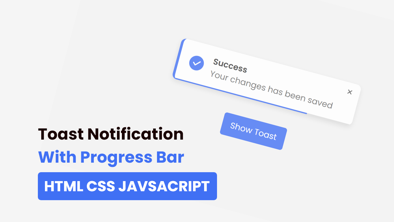
Let’s have a quick look at the given image of our project [Animated Toast Notification with Progress Bar]. At the top, we can see our toast with a progress bar and one cancel button, below it is one button. Actually, at first, there will only be a button, and when we click on the button that toast will appear with progressing bar. Basically, when progress is finished, progressed the toast will automatically disappear or we can close that toast by clicking on the close button.
Now we are going to watch the real demo of this project and the full video tutorial which help you to take ideas on how all HTML CSS and JavaScript are working perfectly behind this project.
Toast Notification with Progress Bar in HTML CSS & JavaScript
I have provided all the HTML CSS and JavaScript code that I have used to create this Animated Toast Notification with Progress Bar, before jumping into the source code file, you need to know some basic printouts of this video tutorial.
As you have seen on the video tutorial of Animated Toast Notification with Progress Bar. At first, we have seen only a button on the screen. When I clicked on the button toast notification slides from the left top side and the progress bar also started. After the progress bar is finished to progress, the toast notification automatically disappeared. I could close that toast by clicking on the close button, that was available on the toast.
The toast and button and of course are made from HTML and CSS, and to animated it I have used some JavaScript code. You can also make it by using HTML and CSS but we will get an issue, when we click on the toast’s close button progress bar got filled.
I hope now you got the basic concept of this project [Toast Notification with Progress Bar], and how it can be made, if you are feeling difficulty creating, I have provided all
You Might Like This:
Toast Notification with Progress Bar [Source Code]
<!DOCTYPE html>
<!-- Coding By CodingNepal - codingnepalweb.com -->
<html lang="en">
<head>
    <meta charset="UTF-8">
    <meta http-equiv="X-UA-Compatible" content="IE=edge">
    <meta name="viewport" content="width=device-width, initial-scale=1.0">

    <!-- ====== Fontawesome CDN Link ====== -->
    <link rel="stylesheet" href="https://cdnjs.cloudflare.com/ajax/libs/font-awesome/6.0.0/css/all.min.css"/>

    <!-- ====== CSS ====== -->
    <link rel="stylesheet" href="style.css">

    <title>Toast Notification with Progress Bar </title>
</head>

<body>

    <div class="toast">
        <div class="toast-content">
            <i class="fas fa-solid fa-check check"></i>

            <div class="message">
                <span class="text text-1">Success</span>
                <span class="text text-2">Your changes has been saved</span>
            </div>
        </div>
        <i class="fa-solid fa-xmark close"></i>

        <div class="progress"></div>
    </div>

    <button>Show Toast</button>

     <script src="script.js"></script>
</body>
</html>
/* Google Font Import - Poppins */
@import url('https://fonts.googleapis.com/css2?family=Poppins:wght@300;400;500;600;700&display=swap');
*{
    margin: 0;
    padding: 0;
    box-sizing: border-box;
    font-family: 'Poppins', sans-serif;
}

body{
    height: 100vh;
    display: flex;
    align-items: center;
    justify-content: center;
    background-color: #f2f2f2;
    overflow: hidden;
}

.toast{
    position: absolute;
    top: 25px;
    right: 30px;
    border-radius: 12px;
    background: #fff;
    padding: 20px 35px 20px 25px;
    box-shadow: 0 5px 10px rgba(0,0,0,0.1);
    border-left: 6px solid #4070f4;
    overflow: hidden;
    transform: translateX(calc(100% + 30px));
    transition: all 0.5s cubic-bezier(0.68, -0.55, 0.265, 1.35);
}

.toast.active{
    transform: translateX(0%);
}

.toast .toast-content{
    display: flex;
    align-items: center;
}

.toast-content .check{
    display: flex;
    align-items: center;
    justify-content: center;
    height: 35px;
    width: 35px;
    background-color: #4070f4;
    color: #fff;
    font-size: 20px;
    border-radius: 50%;
}

.toast-content .message{
    display: flex;
    flex-direction: column;
    margin: 0 20px;
}

.message .text{
    font-size: 20px;
    font-weight: 400;;
    color: #666666;
}

.message .text.text-1{
    font-weight: 600;
    color: #333;
}

.toast .close{
    position: absolute;
    top: 10px;
    right: 15px;
    padding: 5px;
    cursor: pointer;
    opacity: 0.7;
}

.toast .close:hover{
    opacity: 1;
}

.toast .progress{
    position: absolute;
    bottom: 0;
    left: 0;
    height: 3px;
    width: 100%;
    background: #ddd;
}

.toast .progress:before{
    content: '';
    position: absolute;
    bottom: 0;
    right: 0;
    height: 100%;
    width: 100%;
    background-color: #4070f4;
}

.progress.active:before{
    animation: progress 5s linear forwards;
}

@keyframes progress {
    100%{
        right: 100%;
    }
}

button{
    padding: 12px 20px;
    font-size: 20px;
    outline: none;
    border: none;
    background-color: #4070f4;
    color: #fff;
    border-radius: 6px;
    cursor: pointer;
    transition: 0.3s;
}

button:hover{
    background-color: #0e4bf1;
}

.toast.active ~ button{
    pointer-events: none;
}
const button = document.querySelector("button"),
      toast = document.querySelector(".toast")
      closeIcon = document.querySelector(".close"),
      progress = document.querySelector(".progress");

      let timer1, timer2;

      button.addEventListener("click", () => {
        toast.classList.add("active");
        progress.classList.add("active");

        timer1 = setTimeout(() => {
            toast.classList.remove("active");
        }, 5000); //1s = 1000 milliseconds

        timer2 = setTimeout(() => {
          progress.classList.remove("active");
        }, 5300);
      });

      closeIcon.addEventListener("click", () => {
        toast.classList.remove("active");

        setTimeout(() => {
          progress.classList.remove("active");
        }, 300);

        clearTimeout(timer1);
        clearTimeout(timer2);
      });
If you face any difficulties while creating your Animated Toast Notification or your code is not working as expected, you can download the source code files for this Toast for free by clicking on the download button, and you can also view a live demo of this card slider by clicking on the view live button.


plis code
i just made your code more better and access able, if you want i can share
12