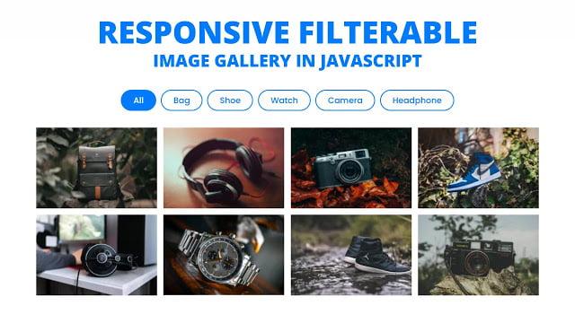
Hey friends, today in this blog you’ll learn how to create a Responsive Filterable Image Gallery using HTML CSS & JavaScript. In the earlier blog, I’ve shared how to create an Image Slider with Slide Controls in JavaScript and now it’s time to create a Responsively Filterable Gallery.
A filterable image gallery means you can display as many images as you want. The most important feature of Filterable Image Gallery is that you will have the control to categorize all the pictures or images based on the specified parameter.
In this design [Responsive Filterable Image Gallery], there are a total of eight images on the webpage with the filter names navbar on the top. These images are specified to the different categories, when you click on the bag, there is only appear the bag-related image, and when you click on the watch, there will appear watch-related images only.
Each image has a click event means when you click on the particular image, that image will appear in a full image preview box with the category name and there is also a cross icon, so you can easily dismiss or close the preview box.
If you want to see this filterable image gallery and how it is created then you can watch a full video tutorial on this program.
Video Tutorial of Responsive Filterable Image Gallery
In the video, you have seen the responsive filterable image gallery which is created using HTML CSS & JavaScript. You can also create this type of filterable gallery easily using many jQuery or JavaScript plugins. If you’re a beginner then you may have difficulties to understanding the JavaScript codes of this program but I did my best to explain each JavaScript line with written comments. So you’ll easily understand the codes once you download the files and try them yourself.
In this program, I didn’t add an image slideshow or image slider controls feature because this video is already too much longer so I decided to add these features and make a separate video for it. In that video, I’ll add slider controls on the preview box so you can easily slide images.
You might like this:
Responsive Filterable Image Gallery [Source Codes]
To create this program [Filterable Image Gallery]. First, you need to create three files, HTML File, CSS File, and JavaScript File. After creating these files just paste the following codes into your files. You can also download the source code files of his image gallery from the given download button.
First, create an HTML file with the name of index.html and paste the given codes in your HTML file. Remember, you’ve to create a file with .html extension and the images that are used on this gallery won’t appear. You’ve to download files from the given download button to use images also.
<!DOCTYPE html>
<!-- Created By CodingNepal - www.codingnepalweb.com -->
<html lang="en">
<head>
    <meta charset="UTF-8">
    <meta name="viewport" content="width=device-width, initial-scale=1.0">
    <title>Filterable Image Gallery | CodingNepal</title>
    <link rel="stylesheet" href="style.css">
    <link rel="stylesheet" href="https://cdnjs.cloudflare.com/ajax/libs/font-awesome/5.15.3/css/all.min.css"/>
</head>
<body>
  <div class="wrapper">
    <!-- filter Items -->
    <nav>
      <div class="items">
        <span class="item active" data-name="all">All</span>
        <span class="item" data-name="bag">Bag</span>
        <span class="item" data-name="shoe">Shoe</span>
        <span class="item" data-name="watch">Watch</span>
        <span class="item" data-name="camera">Camera</span>
        <span class="item" data-name="headphone">Headphone</span>
      </div>
    </nav>
    <!-- filter Images -->
    <div class="gallery">
      <div class="image" data-name="bag"><span><img src="images/bag-1.jpg" alt=""></span></div>
      <div class="image" data-name="headphone"><span><img src="images/headphone-1.jpg" alt=""></span></div>
      <div class="image" data-name="camera"><span><img src="images/camera-1.jpg" alt=""></span></div>
      <div class="image" data-name="shoe"><span><img src="images/shoe-1.jpg" alt=""></span></div>
      <div class="image" data-name="headphone"><span><img src="images/headphone-2.jpg" alt=""></span></div>
      <div class="image" data-name="watch"><span><img src="images/watch-1.jpg" alt=""></span></div>
      <div class="image" data-name="shoe"><span><img src="images/shoe-2.jpg" alt=""></span></div>
      <div class="image" data-name="camera"><span><img src="images/camera-2.jpg" alt=""></span></div>
    </div>
  </div>
  <!-- fullscreen img preview box -->
  <div class="preview-box">
    <div class="details">
      <span class="title">Image Category: <p></p></span>
      <span class="icon fas fa-times"></span>
    </div>
    <div class="image-box"><img src="" alt=""></div>
  </div>
  <div class="shadow"></div>

  <script src="script.js"></script>

</body>
</html>
Second, create a CSS file with the name of style.css and paste the given codes in your CSS file. Remember, you’ve to create a file with .css extension.
@import url('https://fonts.googleapis.com/css2?family=Poppins:wght@200;300;400;500;600;700&display=swap');
*{
  margin: 0;
  padding: 0;
  box-sizing: border-box;
  font-family: 'Poppins', sans-serif;
}
::selection{
  color: #fff;
  background: #007bff;
}
body{
  padding: 10px;
}
.wrapper{
  margin: 100px auto;
  max-width: 1100px;
}
.wrapper nav{
  display: flex;
  justify-content: center;
}
.wrapper .items{
  display: flex;
  max-width: 720px;
  width: 100%;
  justify-content: space-between;
}
.items span{
  padding: 7px 25px;
  font-size: 18px;
  font-weight: 500;
  cursor: pointer;
  color: #007bff;
  border-radius: 50px;
  border: 2px solid #007bff;
  transition: all 0.3s ease;
}
.items span.active,
.items span:hover{
  color: #fff;
  background: #007bff;
}

.gallery{
  display: flex;
  flex-wrap: wrap;
  margin-top: 30px;
}
.gallery .image{
  width: calc(100% / 4);
  padding: 7px;
}
.gallery .image span{
  display: flex;
  width: 100%;
  overflow: hidden;
}
.gallery .image img{
  width: 100%;
  vertical-align: middle;
  transition: all 0.3s ease;
}
.gallery .image:hover img{
  transform: scale(1.1);
}
.gallery .image.hide{
  display: none;
}
.gallery .image.show{
  animation: animate 0.4s ease;
}
@keyframes animate {
  0%{
    transform: scale(0.5);
  }
  100%{
    transform: scale(1);
  }
}

.preview-box{
  position: fixed;
  top: 50%;
  left: 50%;
  transform: translate(-50%, -50%) scale(0.9);
  background: #fff;
  max-width: 700px;
  width: 100%;
  z-index: 5;
  opacity: 0;
  pointer-events: none;
  border-radius: 3px;
  padding: 0 5px 5px 5px;
  box-shadow: 0px 0px 15px rgba(0,0,0,0.2);
}
.preview-box.show{
  opacity: 1;
  pointer-events: auto;
  transform: translate(-50%, -50%) scale(1);
  transition: all 0.3s ease;
}
.preview-box .details{
  padding: 13px 15px 13px 10px;
  display: flex;
  align-items: center;
  justify-content: space-between;
}
.details .title{
  display: flex;
  font-size: 18px;
  font-weight: 400;
}
.details .title p{
  font-weight: 500;
  margin-left: 5px;
}
.details .icon{
  color: #007bff;
  font-style: 22px;
  cursor: pointer;
}
.preview-box .image-box{
  width: 100%;
  display: flex;
}
.image-box img{
  width: 100%;
  border-radius: 0 0 3px 3px;
}
.shadow{
  position: fixed;
  left: 0;
  top: 0;
  height: 100%;
  width: 100%;
  z-index: 2;
  display: none;
  background: rgba(0,0,0,0.4);
}
.shadow.show{
  display: block;
}

@media (max-width: 1000px) {
  .gallery .image{
    width: calc(100% / 3);
  }
}
@media (max-width: 800px) {
  .gallery .image{
    width: calc(100% / 2);
  }
}
@media (max-width: 700px) {
  .wrapper nav .items{
    max-width: 600px;
  }
  nav .items span{
    padding: 7px 15px;
  }
}
@media (max-width: 600px) {
  .wrapper{
    margin: 30px auto;
  }
  .wrapper nav .items{
    flex-wrap: wrap;
    justify-content: center;
  }
  nav .items span{
    margin: 5px;
  }
  .gallery .image{
    width: 100%;
  }
}
Last, create a JavaScript file with the name of script.js and paste the given codes in your JavaScript file. Remember, you’ve to create a file with .js extension.
//selecting all required elements
const filterItem = document.querySelector(".items");
const filterImg = document.querySelectorAll(".gallery .image");

window.onload = ()=>{ //after window loaded
  filterItem.onclick = (selectedItem)=>{ //if user click on filterItem div
    if(selectedItem.target.classList.contains("item")){ //if user selected item has .item class
      filterItem.querySelector(".active").classList.remove("active"); //remove the active class which is in first item
      selectedItem.target.classList.add("active"); //add that active class on user selected item
      let filterName = selectedItem.target.getAttribute("data-name"); //getting data-name value of user selected item and store in a filtername variable
      filterImg.forEach((image) => {
        let filterImges = image.getAttribute("data-name"); //getting image data-name value
        //if user selected item data-name value is equal to images data-name value
        //or user selected item data-name value is equal to "all"
        if((filterImges == filterName) || (filterName == "all")){
          image.classList.remove("hide"); //first remove the hide class from the image
          image.classList.add("show"); //add show class in image
        }else{
          image.classList.add("hide"); //add hide class in image
          image.classList.remove("show"); //remove show class from the image
        }
      });
    }
  }
  for (let i = 0; i < filterImg.length; i++) {
    filterImg[i].setAttribute("onclick", "preview(this)"); //adding onclick attribute in all available images
  }
}

//fullscreen image preview function
//selecting all required elements
const previewBox = document.querySelector(".preview-box"),
categoryName = previewBox.querySelector(".title p"),
previewImg = previewBox.querySelector("img"),
closeIcon = previewBox.querySelector(".icon"),
shadow = document.querySelector(".shadow");

function preview(element){
  //once user click on any image then remove the scroll bar of the body, so user cant scroll up or down
  document.querySelector("body").style.overflow = "hidden";
  let selectedPrevImg = element.querySelector("img").src; //getting user clicked image source link and stored in a variable
  let selectedImgCategory = element.getAttribute("data-name"); //getting user clicked image data-name value
  previewImg.src = selectedPrevImg; //passing the user clicked image source in preview image source
  categoryName.textContent = selectedImgCategory; //passing user clicked data-name value in category name
  previewBox.classList.add("show"); //show the preview image box
  shadow.classList.add("show"); //show the light grey background
  closeIcon.onclick = ()=>{ //if user click on close icon of preview box
    previewBox.classList.remove("show"); //hide the preview box
    shadow.classList.remove("show"); //hide the light grey background
    document.querySelector("body").style.overflow = "auto"; //show the scroll bar on body
  }
}
That’s all, now you’ve successfully created a Responsive Filterable Image Gallery using HTML CSS & JavaScript. If your code doesn’t work or you’ve faced any error/problem then please download the source code files from the given download button. It’s free and a .zip file will be downloaded then you’ve to extract it.


