Hello readers, Today in this blog you’ll learn how to create a 3D Card Flip Card on Hover in HTML & CSS. Earlier I have shared an Animated Profile Card Design in HTML & CSS. Now it’s time to create a 3D Flip Effect or Animation on CSS Card.
What is a card, accurately? Well, they come in all sorts of shapes and sizes, but common cards will include information such as a title, a user name, a picture, and several icons. Sometimes there might be a brief volume of text, for example, a product summary.
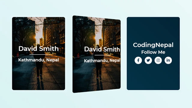
Today in this blog I’ll share with you this program (3D Flip Card on Hover using HTML & CSS). At first, this card in the initial stage where there is no 3D animation or effect but when you hover on this card it rotates 180deg with 3D visualization. In this card, there are two faces (front and back face). At first, there is shown a front face but when you hover on it then it rotates with 3D visualization and shown the back face.
If you’re feeling difficult to understand what I am saying. You can watch a full video tutorial on this program (3D Flip Card on Hover using HTML & CSS).
Video Tutorial of 3D Flip Card on Hover using HTML CSS
If you’re a beginner and you have basic knowledge of HTML & CSS then you can also create these types of CSS cards with 3D animation. There are no vast codes used to create this 3D animation. There is only the creative role of CSS transform property.
If you want to get the source code of this program (3D Flip Card on Hover using HTML & CSS). You can easily get the source codes of this program. To get the source codes you just need to scroll down.
You might like this:
3D Flip Card on Hover in HTML CSS [Source Codes]
To create this program (3D Flip Card on Hover using HTML & CSS). First, you need to create two Files one HTML File and another one is CSS File. After creating these files just paste the following codes in your file.
First, create an HTML file with the name of index.html and paste the given codes in your HTML file. Remember, you’ve to create a file with .html extension.
<!DOCTYPE html>
<!-- Created By CodingNepal -->
<html lang="en" dir="ltr">
   <head>
      <meta charset="utf-8">
      <title>3D Flip Card</title>
      <link rel="stylesheet" href="style.css">
      <link rel="stylesheet" href="https://cdnjs.cloudflare.com/ajax/libs/font-awesome/5.15.3/css/all.min.css"/>
   </head>
   <body>
      <div class="center">
         <div class="front-face">
            <div class="contents front">
               <p>
                  David Smith
               </p>
               <span>Kathmandu, Nepal</span>
            </div>
         </div>
         <div class="back-face">
            <div class="contents back">
               <h2>
                  CodingNepal
               </h2>
               <span>Follow Me</span>
               <div class="icons">
                  <i class="fab fa-facebook-f"></i>
                  <i class="fab fa-twitter"></i>
                  <i class="fab fa-instagram"></i>
                  <i class="fab fa-linkedin-in"></i>
               </div>
            </div>
         </div>
      </div>
   </body>
</html>
Second, create a CSS file with the name of style.css and paste the given codes in your CSS file. Remember, you’ve to create a file with .css extension.
@import url('https://fonts.googleapis.com/css?family=Montserrat:600&display=swap');
*{
  margin: 0;
  padding: 0;
  box-sizing: border-box;
}
body{
  height: 100vh;
  font-family: 'Montserrat', sans-serif;
  background: linear-gradient(45deg,#d8f2f3 0%,#ebf9f9 100%);
}
.center,.front-face,
.contents,.back-face{
  position: absolute;
}
.center{
  top: 50%;
  left: 50%;
  transform: translate(-50%, -50%);
  height: 400px;
  width: 290px;
  transform-style: preserve-3d;
 perspective: 1000px;
}
.front-face, .back-face{
  height: 100%;
  width: 100%;
  text-align: center;
  background: linear-gradient(rgba(0,0,0,.2),
              rgba(0,0,0,.2)),url(bg.jpeg);
  background-size: cover;
  background-position: center;
  transform: translateY(0deg);
  border-radius: 10px;
  backface-visibility: hidden;
  transform-style: preserve-3d;
  transition: transform .7s cubic-bezier(.4,.2,.2,1);
}
.contents{
  left: 0%;
  top: 50%;
  width: 100%;
  perspective: 1000px;
  transform: translateY(-50%) translateZ(60px) scale(0.94);
}
.front p{
  font-size: 35px;
  margin-bottom: 15px;
  color: white;
}
.front span{
  font-size: 23px;
  color: white;
}
.front p:after{
  content: '';
  display: block;
  left: 0;
  right: 0;
  width: 100px;
  height: 2px;
  background: white;
  margin: 0 auto;
  margin-top: 10px;
}
.back-face{
  transform: rotateY(180deg);
  background: linear-gradient(45deg,#043348 0%,#032535 100%);
}
.back {
  color: white;
}
.back h2{
  font-size: 33px;
  padding-bottom: 5px;
}
.back span{
  font-size: 25px;
}
.icons{
  margin: 10px 0;
  display: block;
}
i.fab{
  color:  #042f4b;
  font-size: 20px;
  height: 40px;
  width: 40px;
  background: white;
  border-radius: 50%;
  margin: 0 5px;
  line-height: 40px;
  cursor: pointer;
}
.center:hover > .back-face{
  transform: rotateY(0deg);
}
.center:hover > .front-face{
  transform: rotateY(-180deg);
}
That’s all, now you’ve successfully created a 3D Flip Card on Hover using HTML & CSS. If your code not work or you’ve faced any error/problem then please comment down or contact us from the contact page.


