Hello readers, Today in this blog you’ll learn how to build a Working Analog Clock using HTML CSS & Javascript. Earlier I have shared a Working Digital Clock using HTML CSS & Javascript, now it’s time to create a Working Analog Clock using Javascript.
A clock or watch is called “analog” when it has moving hands and (normally) hours marked from 1 to 12 to show you the time. Some have Roman Numerals (I, II, III, etc) instead, or no numbers at all.
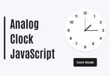
As you can see in the image, this is an Analog Clock that is based on HTML CSS & Javascript. There are 12 marks for showing times 1 to 12 and 3 handles for showing minutes, hours, and second. As usual, the hour handle is small, and the minute handle is bigger than that, and the second handle larger overall.
If you’re feeling difficulty understanding what I am saying. You can watch a full video tutorial on this program (Working Analog Clock).
Video Tutorial of Working Analog Clock using JavaScript
As you see in the video this is a real-time working clock. This time takes from your PC, not from the server. I am sharing this live clock program, which functions is work in javascript. I had already shared many Javascript projects, click here to watch them all.
If you like this program (Working Analog Clock) and want to get the source codes of this program. You can easily get it from the download link which is given below.
Working Analog Clock in HTML CSS & JavaScript [Source Codes]
To create this program (Working Analog Clock). First, you need to create two Files one HTML File and another one is CSS File. After creating these files just paste the following codes in your file.
First, create an HTML file with the name of index.html and paste the given codes in your HTML file. Remember, you’ve to create a file with .html extension.
<!DOCTYPE html>
<!-- Created By CodingNepal -->
<html lang="en" dir="ltr">
   <head>
      <meta charset="utf-8">
      <title>Neumorphism Analog Clock | CodingNepal</title>
      <link rel="stylesheet" href="style.css">
   </head>
   <body>
      <div class="clock">
         <div class="center-nut"></div>
         <div class="center-nut2"></div>
         <div class="indicators">
            <div></div>
            <div></div>
            <div></div>
            <div></div>
            <div></div>
            <div></div>
            <div></div>
            <div></div>
            <div></div>
            <div></div>
            <div></div>
            <div></div>
         </div>
         <div class="sec-hand">
            <div class="sec"></div>
         </div>
         <div class="min-hand">
            <div class="min"></div>
         </div>
         <div class="hr-hand">
            <div class="hr"></div>
         </div>
      </div>
      <script>
         const sec = document.querySelector(".sec");
         const min = document.querySelector(".min");
         const hr = document.querySelector(".hr");
         setInterval(function(){
           let time  = new Date();
           let secs = time.getSeconds() * 6;
           let mins = time.getMinutes() * 6;
           let hrs = time.getHours() * 30;
           sec.style.transform = `rotateZ(${secs}deg)`;
           min.style.transform = `rotateZ(${mins}deg)`;
           hr.style.transform = `rotateZ(${hrs+(mins/12)}deg)`;
         });
      </script>
   </body>
</html>
Second, create a CSS file with the name of style.css and paste the given codes in your CSS file. Remember, you’ve to create a file with .css extension.
*{
  margin: 0;
  padding: 0;
  box-sizing: border-box;
}
html,body{
  height: 100%;
}
body{
  display: grid;
  place-items: center;
  background: #dde1e7;
  text-align: center;
}
.clock{
  position: relative;
  display: flex;
  align-items: center;
  justify-content: center;
  background: #dde1e7;
  height: 250px;
  width: 250px;
  border-radius: 50%;
  box-shadow: -3px -3px 7px #ffffff73,
              3px 3px 5px rgba(94,104,121,0.288);
}
.clock:before{
  position: absolute;
  content: '';
  height: 220px;
  width: 220px;
  background: #dde1e7;
  border-radius: 50%;
  box-shadow: inset -3px -3px 7px #ffffff73,
              inset 3px 3px 5px rgba(94,104,121,0.288);
}
.clock:after{
  position: absolute;
  content: '';
  height: 120px;
  width: 120px;
  background: #dde1e7;
  border-radius: 50%;
  box-shadow: -1px -1px 5px #ffffff73,
              1px 1px 3px rgba(94,104,121,0.288);
}
.clock .center-nut{
  height: 15px;
  width: 15px;
  background: #404040;
  border-radius: 50%;
  z-index: 2;
  position: absolute;
}
.clock .center-nut2{
  height: 9px;
  width: 9px;
  background: #3498db;
  border-radius: 50%;
  z-index: 15;
  position: absolute;
}
.indicators div{
  position: absolute;
  width: 2px;
  height: 5px;
  background: #404040;
}
.indicators div:nth-child(1){
  transform: rotate(30deg) translateY(-100px);
}
.indicators div:nth-child(2){
  transform: rotate(60deg) translateY(-100px);
}
.indicators div:nth-child(3){
  background: #3498db;
  transform: rotate(90deg) translateY(-100px);
}
.indicators div:nth-child(4){
  transform: rotate(120deg) translateY(-100px);
}
.indicators div:nth-child(5){
  transform: rotate(150deg) translateY(-100px);
}
.indicators div:nth-child(6){
  background: #3498db;
  transform: rotate(180deg) translateY(-100px);
}
.indicators div:nth-child(7){
  transform: rotate(210deg) translateY(-100px);
}
.indicators div:nth-child(8){
  transform: rotate(240deg) translateY(-100px);
}
.indicators div:nth-child(9){
  background: #3498db;
  transform: rotate(270deg) translateY(-100px);
}
.indicators div:nth-child(10){
  transform: rotate(300deg) translateY(-100px);
}
.indicators div:nth-child(11){
  transform: rotate(330deg) translateY(-100px);
}
.indicators div:nth-child(12){
  background: #3498db;
  transform: rotate(360deg) translateY(-100px);
}
.sec-hand,.min-hand,.hr-hand{
  position: absolute;
}
.sec-hand, .sec{
  height: 180px;
  width: 180px;
  z-index: 6;
}
.min-hand, .min{
  height: 140px;
  width: 140px;
  z-index: 5;
}
.hr-hand, .hr{
  height: 110px;
  width: 110px;
  z-index: 4;
}
.sec,.min,.hr{
  display: flex;
  justify-content: center;
  position: absolute;
}
.sec:before{
  position: absolute;
  content: '';
  height: 110px;
  width: 3px;
  background: #3498db;
}
.sec:after{
  position: absolute;
  content: '';
  height: 35px;
  width: 7px;
  background: #3498db;
  top: 105px;
  border-radius: 5px;
}
.min:before{
  position: absolute;
  content: '';
  width: 1px;
  top: -15px;
  border-left: 3px solid transparent;
  border-right: 3px solid transparent;
  border-bottom: 60px solid #e95949;
}
.min:after{
  position: absolute;
  content: '';
  width: 3px;
  top: 40px;
  border-left: 2px solid transparent;
  border-right: 2px solid transparent;
  border-top: 30px solid #e95949;
}
.hr:before{
  position: absolute;
  content: '';
  width: 1px;
  border-left: 3px solid transparent;
  border-right: 3px solid transparent;
  border-bottom: 35px solid #303030;
}
.hr:after{
  position: absolute;
  content: '';
  width: 3px;
  top: 34px;
  border-left: 2px solid transparent;
  border-right: 2px solid transparent;
  border-top: 25px solid #303030;
}
That’s all, now you’ve successfully created a Working Analog Clock using HTML CSS & JavaScript. If your code does not work or you’ve faced any error/problem then please comment down or contact us from the contact page.


Can put video call or audio call in that ChatApp
It would be too much better!!!
Hi coding nepal
Hello there!
Btw…The clock not working…Its only show the second’s hand which one not working
It’s really help me… Thanks
You’re welcome!
Awesome
Thanks
In This Click No JS Is Used
Thank you 🙂
Thank you 🙂
Nice
Nice Clock